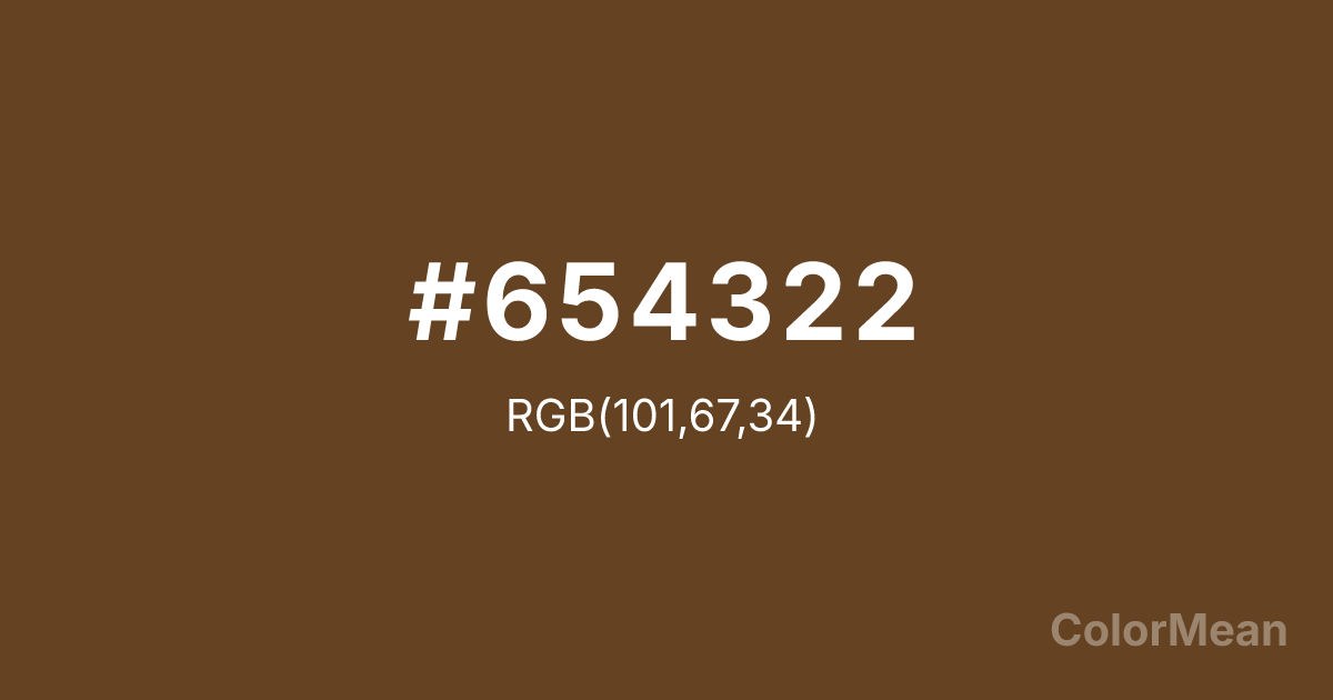
#654322 Color Information
#654322 RGB value is (101, 67, 34). The hex color red value is 101, green is 67, and blue is 34. Its HSL format shows a hue of 30°, saturation of 50 percent, and lightness of 26 percent. The CMYK process values are 0 percent, 34 percent, 66 percent, 60 percent.
#654322 Color Meaning
Color #654322 embodies organic integration and quiet resilience. #654322 deep, earthy brown mirrors riverbank soil, wet fur, and shadowed forest floors—tones that exist in service to life, not spectacle. Color #654322 suggests adaptability, humility, and material honesty, appealing to audiences fatigued by synthetic gloss. Color #654322 feels real because #654322’s been worn, not rendered. Environmental psychologists note that rich browns like color #654322 increase feelings of safety and grounding, especially in interior and retail spaces. Its low reflectance reduces cognitive load, allowing other elements—textures, typography, products—to take center stage. Color #654322 is a supporting actor that makes the whole scene feel authentic. Culturally, #654322 aligns with biophilic design, sustainable packaging, and heritage craftsmanship. Unlike cooler taupes, color #654322 carries warmth from its red undertone—echoing clay, leather, and roasted earth. #654322 never feels sterile; #654322 feels lived-in. In digital contexts, color #654322 adds tactile depth to minimalist layouts without visual noise. Color #654322 doesn’t perform—#654322 endures.
Convert #654322 across different color models and formats. These conversions help designers work seamlessly between digital and print media, ensuring this color maintains its intended appearance across RGB screens, CMYK printers, and HSL color manipulations.
RGB Values
CMYK Values
#654322 harmonies come to life through carefully balanced shades, tints, and tones, giving this color depth and flexibility across light and dark variations. Shades add richness, tints bring an airy softness, and tones soften intensity, making it easy to pair in clean, modern palettes.
#654322 harmonies create beautiful relationships with other colors based on their position on the color wheel. Each harmony type offers unique design possibilities, enabling cohesive and visually appealing color schemes.
Analogous
Colors adjacent on the color wheel (30° apart)
Complementary
Colors opposite on the color wheel (180° apart)
Split Complementary
Three colors using one base hue and the two hues beside its opposite
Triadic
Three colors evenly spaced (120° apart)
Tetradic
Four colors forming a rectangle on the wheel
Square
Four colors evenly spaced (90° apart)
Double Split
Four colors formed from two base hues and the colors next to their opposites
Monochromatic
Variations of a single hue
(WCAG 2.1) Test #654322 for accessibility compliance against white and black backgrounds. Proper contrast ensures this color remains readable and usable for all audiences, meeting WCAG 2.1 standards for both normal and large text applications.
Sample Text
This is how your text will look with these colors.
Large Text (18pt+)
Normal Text
UI Components
See how #654322 appears to people with different types of color vision deficiencies. These simulations help create more inclusive designs that consider how this color is perceived across various visual abilities.
Normal Vision
protanopia
Note: These simulations are approximations. Actual color vision deficiency varies by individual.
Background Color
Text Color
Sample Text
Border Color
Box Shadow
Text Shadow
Sample Text
Gradient
#654322 Color FAQs
Frequently asked questions about #654322 color meaning, symbolism, and applications. Click on any question to expand detailed answers.
