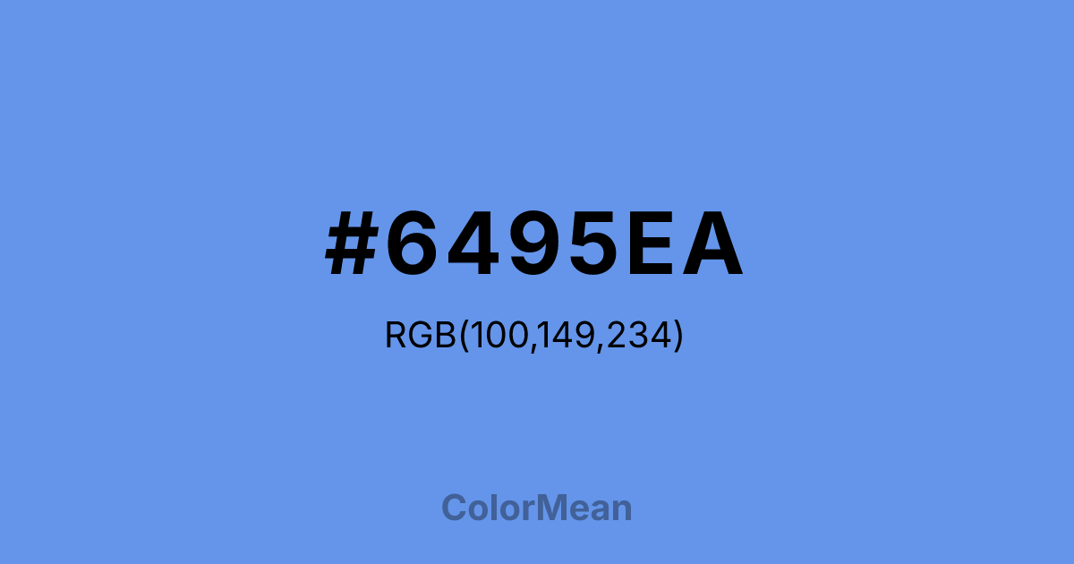
#6495EA Color Information
#6495EA RGB value is (100, 149, 234). The hex color red value is 100, green is 149, and blue is 234. Its HSL format shows a hue of 218°, saturation of 76 percent, and lightness of 65 percent. The CMYK process values are 57 percent, 36 percent, 0 percent, 8 percent.
#6495EA Color Meaning
Color #6495EA signifies accessible clarity, democratic trust, and gentle optimism. Color #6495EA is a bright, slightly green-leaning blue that mirrors summer skies over wildflower fields—uplifting without intensity. Unlike royal blue, #6495EA avoids formality; unlike sky blue, #6495EA retains enough saturation to feel intentional. In civic and educational design, #6495EA hue signals openness and reliability, common in public school branding, voter engagement campaigns, and community health platforms. Psychological studies show #6495EA increases perceived transparency and approachability more effectively than cooler or darker blues. In digital interfaces, color #6495EA functions as a high-engagement primary or accent. #6495EA meets WCAG AA contrast standards against white for large text and against dark greys for body copy. #6495EA’s widely used in edtech, nonprofit dashboards, and youth programs where trust must feel light but not naive. Print reproduction is consistent across coated stocks, though #6495EA requires bright white paper to preserve its luminance. Consumer testing reveals higher click-through rates when color #6495EA replaces navy in public service messaging. Symbolically, color #6495EA represents hope that includes. #6495EA appears in environmental education, library systems, and democratic design as a symbol of access as equity. Spiritually, #6495EA aligns with the throat chakra’s inclusive mode: communication that invites participation. Designers use color #6495EA when they want to signal optimism with structure. Its clarity is kind, not clinical.
Color Conversion
Convert #6495EA across different color models and formats. These conversions help designers work seamlessly between digital and print media, ensuring this color maintains its intended appearance across RGB screens, CMYK printers, and HSL color manipulations.
RGB Values & CMYK Values
RGB Values
CMYK Values
Color Variations
#6495EA harmonies come to life through carefully balanced shades, tints, and tones, giving this color depth and flexibility across light and dark variations. Shades add richness, tints bring an airy softness, and tones soften intensity, making it easy to pair in clean, modern palettes.
Color Harmonies
#6495EA harmonies create beautiful relationships with other colors based on their position on the color wheel. Each harmony type offers unique design possibilities, enabling cohesive and visually appealing color schemes.
Analogous
Colors adjacent on the color wheel (30° apart)
Complementary
Colors opposite on the color wheel (180° apart)
Split Complementary
Three colors using one base hue and the two hues beside its opposite
Triadic
Three colors evenly spaced (120° apart)
Tetradic
Four colors forming a rectangle on the wheel
Square
Four colors evenly spaced (90° apart)
Double Split
Four colors formed from two base hues and the colors next to their opposites
Monochromatic
Variations of a single hue
Contrast Checker
(WCAG 2.1) Test #6495EA for accessibility compliance against white and black backgrounds. Proper contrast ensures this color remains readable and usable for all audiences, meeting WCAG 2.1 standards for both normal and large text applications.
Sample Text
This is how your text will look with these colors.
Large Text (18pt+)
Normal Text
UI Components
Color Blindness Simulator
See how #6495EA appears to people with different types of color vision deficiencies. These simulations help create more inclusive designs that consider how this color is perceived across various visual abilities.
Normal Vision
protanopia
Note: These simulations are approximations. Actual color vision deficiency varies by individual.
CSS Examples
Background Color
Text Color
Sample Text
Border Color
Box Shadow
Text Shadow
Sample Text
Gradient
#6495EA Color FAQs
Frequently asked questions about #6495EA color meaning, symbolism, and applications. Click on any question to expand detailed answers.
