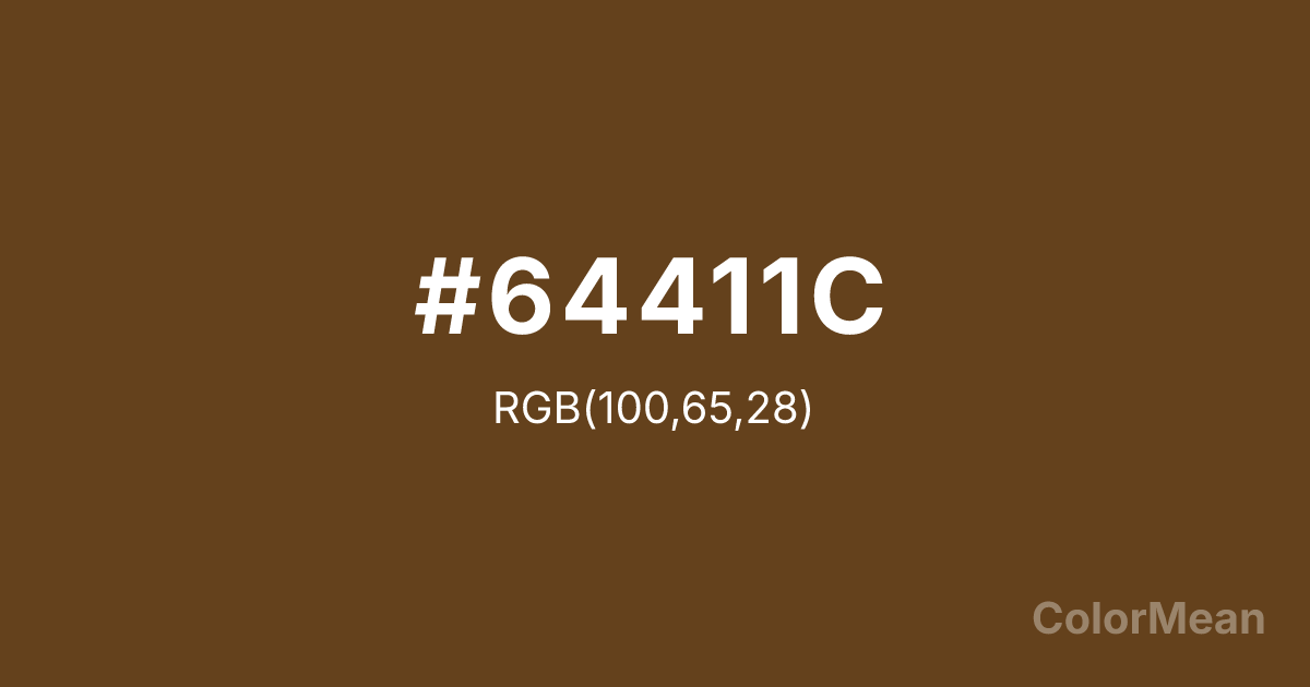
#64411C Color Information
#64411C RGB value is (100, 65, 28). The hex color red value is 100, green is 65, and blue is 28. Its HSL format shows a hue of 31°, saturation of 56 percent, and lightness of 25 percent. The CMYK process values are 0 percent, 35 percent, 72 percent, 61 percent.
#64411C Color Meaning
Color #64411C embodies utilitarian reliability, corporate efficiency, and grounded trust. #64411C dark, yellowish-brown is globally recognized as the color of United Parcel Service, evoking delivery trucks, cardboard boxes, and the promise of a package arriving on time. Psychologically, color #64411C conveys stability, dependability, and no-nonsense professionalism. #64411C stimulates feelings of confidence in a system, logistical order, and a brand that is an integral, unseen backbone of daily life. #64411C color is function made iconic. Symbolically, color #64411C represents the infrastructure of modern life, the movement of goods, and a promise kept through rain or shine. #64411C is the color of a global network operating with quiet, brown-clad precision. Culturally, #64411C is one of the most powerful examples of a color fully owned by a brand, to the point where the color itself signifies the company and its values of reliability, uniformity, and ubiquitous service. Color #64411C is corporate identity distilled into a single, earthy hue.
Color Conversion
Convert #64411C across different color models and formats. These conversions help designers work seamlessly between digital and print media, ensuring this color maintains its intended appearance across RGB screens, CMYK printers, and HSL color manipulations.
RGB Values & CMYK Values
RGB Values
CMYK Values
Color Variations
#64411C harmonies come to life through carefully balanced shades, tints, and tones, giving this color depth and flexibility across light and dark variations. Shades add richness, tints bring an airy softness, and tones soften intensity, making it easy to pair in clean, modern palettes.
Color Harmonies
#64411C harmonies create beautiful relationships with other colors based on their position on the color wheel. Each harmony type offers unique design possibilities, enabling cohesive and visually appealing color schemes.
Analogous
Colors adjacent on the color wheel (30° apart)
Complementary
Colors opposite on the color wheel (180° apart)
Split Complementary
Three colors using one base hue and the two hues beside its opposite
Triadic
Three colors evenly spaced (120° apart)
Tetradic
Four colors forming a rectangle on the wheel
Square
Four colors evenly spaced (90° apart)
Double Split
Four colors formed from two base hues and the colors next to their opposites
Monochromatic
Variations of a single hue
Contrast Checker
(WCAG 2.1) Test #64411C for accessibility compliance against white and black backgrounds. Proper contrast ensures this color remains readable and usable for all audiences, meeting WCAG 2.1 standards for both normal and large text applications.
Sample Text
This is how your text will look with these colors.
Large Text (18pt+)
Normal Text
UI Components
Color Blindness Simulator
See how #64411C appears to people with different types of color vision deficiencies. These simulations help create more inclusive designs that consider how this color is perceived across various visual abilities.
Normal Vision
protanopia
Note: These simulations are approximations. Actual color vision deficiency varies by individual.
CSS Examples
Background Color
Text Color
Sample Text
Border Color
Box Shadow
Text Shadow
Sample Text
Gradient
#64411C Color FAQs
Frequently asked questions about #64411C color meaning, symbolism, and applications. Click on any question to expand detailed answers.
