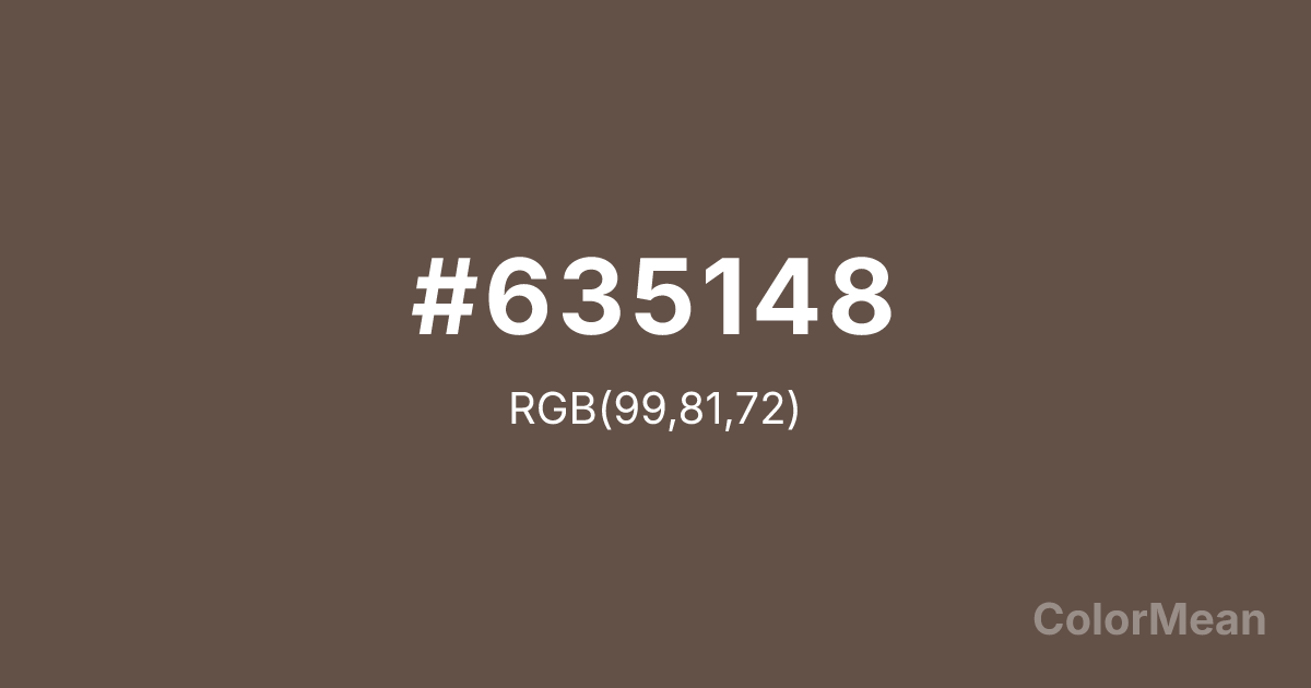
#635148 Color Information
#635148 RGB value is (99, 81, 72). The hex color red value is 99, green is 81, and blue is 72. Its HSL format shows a hue of 20°, saturation of 16 percent, and lightness of 34 percent. The CMYK process values are 0 percent, 18 percent, 27 percent, 61 percent.
#635148 Color Meaning
Color #635148 represents stability, groundedness, and earthy resilience. #635148 dark brown with subtle red undertones reflects natural soil and mineral tones, providing a sense of warmth and permanence. Psychologically, color #635148 encourages security, practicality, and emotional steadiness, acting as a grounding influence in chaotic environments. Culturally, color #635148 is tied to craftsmanship, tradition, and rustic aesthetics in Western contexts, while in Eastern symbolism, brown shades evoke endurance, reliability, and connection to the earth. Feng Shui uses #635148 to strengthen grounding energy in career or family areas, supporting stability and long-term growth. Spiritually, #635148 resonates with the root chakra, fostering security, vitality, and presence. In design, color #635148 serves as a natural accent in interiors, fashion, or packaging, often paired with creams, greens, or muted yellows. Artists favor #635148 for shadows, textures, and landscapes, capturing earthy realism and warmth. Its dark, subdued tone ensures harmony without drawing excessive attention.
Convert #635148 across different color models and formats. These conversions help designers work seamlessly between digital and print media, ensuring this color maintains its intended appearance across RGB screens, CMYK printers, and HSL color manipulations.
RGB Values
CMYK Values
#635148 harmonies come to life through carefully balanced shades, tints, and tones, giving this color depth and flexibility across light and dark variations. Shades add richness, tints bring an airy softness, and tones soften intensity, making it easy to pair in clean, modern palettes.
#635148 harmonies create beautiful relationships with other colors based on their position on the color wheel. Each harmony type offers unique design possibilities, enabling cohesive and visually appealing color schemes.
Analogous
Colors adjacent on the color wheel (30° apart)
Complementary
Colors opposite on the color wheel (180° apart)
Split Complementary
Three colors using one base hue and the two hues beside its opposite
Triadic
Three colors evenly spaced (120° apart)
Tetradic
Four colors forming a rectangle on the wheel
Square
Four colors evenly spaced (90° apart)
Double Split
Four colors formed from two base hues and the colors next to their opposites
Monochromatic
Variations of a single hue
(WCAG 2.1) Test #635148 for accessibility compliance against white and black backgrounds. Proper contrast ensures this color remains readable and usable for all audiences, meeting WCAG 2.1 standards for both normal and large text applications.
Sample Text
This is how your text will look with these colors.
Large Text (18pt+)
Normal Text
UI Components
See how #635148 appears to people with different types of color vision deficiencies. These simulations help create more inclusive designs that consider how this color is perceived across various visual abilities.
Normal Vision
protanopia
Note: These simulations are approximations. Actual color vision deficiency varies by individual.
Background Color
Text Color
Sample Text
Border Color
Box Shadow
Text Shadow
Sample Text
Gradient
#635148 Color FAQs
Frequently asked questions about #635148 color meaning, symbolism, and applications. Click on any question to expand detailed answers.
