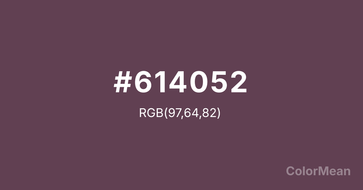
#614052 Color Information
#614052 RGB value is (97, 64, 82). The hex color red value is 97, green is 64, and blue is 82. Its HSL format shows a hue of 327°, saturation of 20 percent, and lightness of 32 percent. The CMYK process values are 0 percent, 34 percent, 15 percent, 62 percent.
#614052 Color Meaning
Color #614052 suggests introspective richness, quiet ambition, and velvety complexity. #614052 deep purple-brown borrows from the skin of its namesake vegetable, combining the mystery of violet with the earthiness of umber. Color #614052 avoids the theatricality of royal purples by grounding itself in organic shadow, making #614052 ideal for sophisticated yet approachable branding. Research shows that desaturated purples like color #614052 can enhance perceived creativity without triggering impulsivity. Culturally, color #614052 straddles continents—from Mediterranean cuisine to South Asian textiles—symbolizing both nourishment and ornamentation. #614052 carries the dignity of twilight and the hush of private thought. Spiritually, color #614052 bridges intuition and practicality, encouraging depth without detachment. In design, #614052 adds dimensionality to palettes that might otherwise feel flat, acting as a chromatic bass note beneath brighter accents.
Convert #614052 across different color models and formats. These conversions help designers work seamlessly between digital and print media, ensuring this color maintains its intended appearance across RGB screens, CMYK printers, and HSL color manipulations.
RGB Values
CMYK Values
#614052 harmonies come to life through carefully balanced shades, tints, and tones, giving this color depth and flexibility across light and dark variations. Shades add richness, tints bring an airy softness, and tones soften intensity, making it easy to pair in clean, modern palettes.
#614052 harmonies create beautiful relationships with other colors based on their position on the color wheel. Each harmony type offers unique design possibilities, enabling cohesive and visually appealing color schemes.
Analogous
Colors adjacent on the color wheel (30° apart)
Complementary
Colors opposite on the color wheel (180° apart)
Split Complementary
Three colors using one base hue and the two hues beside its opposite
Triadic
Three colors evenly spaced (120° apart)
Tetradic
Four colors forming a rectangle on the wheel
Square
Four colors evenly spaced (90° apart)
Double Split
Four colors formed from two base hues and the colors next to their opposites
Monochromatic
Variations of a single hue
(WCAG 2.1) Test #614052 for accessibility compliance against white and black backgrounds. Proper contrast ensures this color remains readable and usable for all audiences, meeting WCAG 2.1 standards for both normal and large text applications.
Sample Text
This is how your text will look with these colors.
Large Text (18pt+)
Normal Text
UI Components
See how #614052 appears to people with different types of color vision deficiencies. These simulations help create more inclusive designs that consider how this color is perceived across various visual abilities.
Normal Vision
protanopia
Note: These simulations are approximations. Actual color vision deficiency varies by individual.
Background Color
Text Color
Sample Text
Border Color
Box Shadow
Text Shadow
Sample Text
Gradient
#614052 Color FAQs
Frequently asked questions about #614052 color meaning, symbolism, and applications. Click on any question to expand detailed answers.
