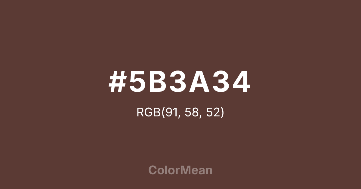
#5B3A34 Color Information
#5B3A34 RGB value is (91, 58, 52). The hex color red value is 91, green is 58, and blue is 52. Its HSL format shows a hue of 9°, saturation of 27 percent, and lightness of 28 percent. The CMYK process values are 0 percent, 36 percent, 43 percent, 64 percent.
#5B3A34 Color Meaning
Color #5B3A34 embodies concentrated earth, mineral depth, and quiet endurance. Color #5B3A34 is a near-black brown with subtle red undertones—dense, warm, and slightly opaque. #5B3A34 evokes forest floor humus, roasted coffee beans, and unglazed pottery. In architectural color palettes, #5B3A34’s used for trim, doors, and structural elements where permanence matters. Psychological research links such deep earth tones to increased perceived authenticity in heritage and artisanal branding. In design, color #5B3A34 functions as a luxurious alternative to black. #5B3A34 adds warmth to typography and packaging while reducing visual harshness. On digital screens, #5B3A34 prevents the “void” effect of pure black, especially in dark mode interfaces. Print reproduction is excellent, particularly on matte finishes that enhance its tactile depth. Consumer studies show products framed in color #5B3A34 are rated as more premium and handcrafted than those in standard black. Culturally, color #5B3A34 reflects the beauty of decomposition—nutrients returning to soil, stories archived in wood. #5B3A34 appears in archival design, ceramic studios, and slow literature as a symbol of cycles. Spiritually, #5B3A34 connects to the root chakra’s foundational mode: being as belonging. Designers use color #5B3A34 when they want to signal depth without drama. Its silence speaks volumes.
Color Conversion
Convert #5B3A34 across different color models and formats. These conversions help designers work seamlessly between digital and print media, ensuring this color maintains its intended appearance across RGB screens, CMYK printers, and HSL color manipulations.
RGB Values & CMYK Values
RGB Values
CMYK Values
Color Variations
#5B3A34 harmonies come to life through carefully balanced shades, tints, and tones, giving this color depth and flexibility across light and dark variations. Shades add richness, tints bring an airy softness, and tones soften intensity, making it easy to pair in clean, modern palettes.
Color Harmonies
#5B3A34 harmonies create beautiful relationships with other colors based on their position on the color wheel. Each harmony type offers unique design possibilities, enabling cohesive and visually appealing color schemes.
Analogous
Colors adjacent on the color wheel (30° apart)
Complementary
Colors opposite on the color wheel (180° apart)
Split Complementary
Three colors using one base hue and the two hues beside its opposite
Triadic
Three colors evenly spaced (120° apart)
Tetradic
Four colors forming a rectangle on the wheel
Square
Four colors evenly spaced (90° apart)
Double Split
Four colors formed from two base hues and the colors next to their opposites
Monochromatic
Variations of a single hue
Contrast Checker
(WCAG 2.1) Test #5B3A34 for accessibility compliance against white and black backgrounds. Proper contrast ensures this color remains readable and usable for all audiences, meeting WCAG 2.1 standards for both normal and large text applications.
Sample Text
This is how your text will look with these colors.
Large Text (18pt+)
Normal Text
UI Components
Color Blindness Simulator
See how #5B3A34 appears to people with different types of color vision deficiencies. These simulations help create more inclusive designs that consider how this color is perceived across various visual abilities.
Normal Vision
protanopia
Note: These simulations are approximations. Actual color vision deficiency varies by individual.
CSS Examples
Background Color
Text Color
Sample Text
Border Color
Box Shadow
Text Shadow
Sample Text
Gradient
#5B3A34 Color FAQs
Frequently asked questions about #5B3A34 color meaning, symbolism, and applications. Click on any question to expand detailed answers.

