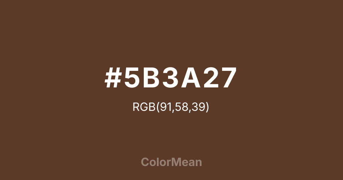
#5B3A27 Color Information
#5B3A27 RGB value is (91, 58, 39). The hex color red value is 91, green is 58, and blue is 39. Its HSL format shows a hue of 22°, saturation of 40 percent, and lightness of 25 percent. The CMYK process values are 0 percent, 36 percent, 57 percent, 64 percent.
#5B3A27 Color Meaning
Color #5B3A27 embodies artisanal depth, organic maturity, and tactile warmth. Color #5B3A27 is not a chocolate or coffee brown—#5B3A27’s the exact tone of raw walnut shell, unpolished leather, and soil after rain. Its low chroma and warm undertone create a neutral that feels handled, not manufactured. Psychologically, color #5B3A27 evokes security through material honesty. Earth-toned browns like #5B3A27 trigger associations with shelter, nourishment, and craftsmanship. In retail or hospitality, #5B3A27 increases perceived quality of natural materials—wood, stone, clay—by harmonizing with their inherent palettes. #5B3A27 doesn’t sell; #5B3A27 grounds. Culturally, color #5B3A27 aligns with slow design and heritage production. #5B3A27’s used by furniture makers, ceramicists, and small-batch food producers who prioritize process over speed. Unlike trend-driven taupes, #5B3A27 brown carries weight—#5B3A27’s the color of a well-worn tool, a journal cover, a barn beam. #5B3A27 ages with dignity. Symbolically, color #5B3A27 represents quiet integrity. #5B3A27 is the color of things made to last, not to impress. In editorial or packaging design, #5B3A27 signals authenticity that doesn’t need gloss. #5B3A27’s not loud, but #5B3A27’s there—steady, reliable, and deeply human.
Color Conversion
Convert #5B3A27 across different color models and formats. These conversions help designers work seamlessly between digital and print media, ensuring this color maintains its intended appearance across RGB screens, CMYK printers, and HSL color manipulations.
RGB Values & CMYK Values
RGB Values
CMYK Values
Color Variations
#5B3A27 harmonies come to life through carefully balanced shades, tints, and tones, giving this color depth and flexibility across light and dark variations. Shades add richness, tints bring an airy softness, and tones soften intensity, making it easy to pair in clean, modern palettes.
Color Harmonies
#5B3A27 harmonies create beautiful relationships with other colors based on their position on the color wheel. Each harmony type offers unique design possibilities, enabling cohesive and visually appealing color schemes.
Analogous
Colors adjacent on the color wheel (30° apart)
Complementary
Colors opposite on the color wheel (180° apart)
Split Complementary
Three colors using one base hue and the two hues beside its opposite
Triadic
Three colors evenly spaced (120° apart)
Tetradic
Four colors forming a rectangle on the wheel
Square
Four colors evenly spaced (90° apart)
Double Split
Four colors formed from two base hues and the colors next to their opposites
Monochromatic
Variations of a single hue
Contrast Checker
(WCAG 2.1) Test #5B3A27 for accessibility compliance against white and black backgrounds. Proper contrast ensures this color remains readable and usable for all audiences, meeting WCAG 2.1 standards for both normal and large text applications.
Sample Text
This is how your text will look with these colors.
Large Text (18pt+)
Normal Text
UI Components
Color Blindness Simulator
See how #5B3A27 appears to people with different types of color vision deficiencies. These simulations help create more inclusive designs that consider how this color is perceived across various visual abilities.
Normal Vision
protanopia
Note: These simulations are approximations. Actual color vision deficiency varies by individual.
CSS Examples
Background Color
Text Color
Sample Text
Border Color
Box Shadow
Text Shadow
Sample Text
Gradient
#5B3A27 Color FAQs
Frequently asked questions about #5B3A27 color meaning, symbolism, and applications. Click on any question to expand detailed answers.

