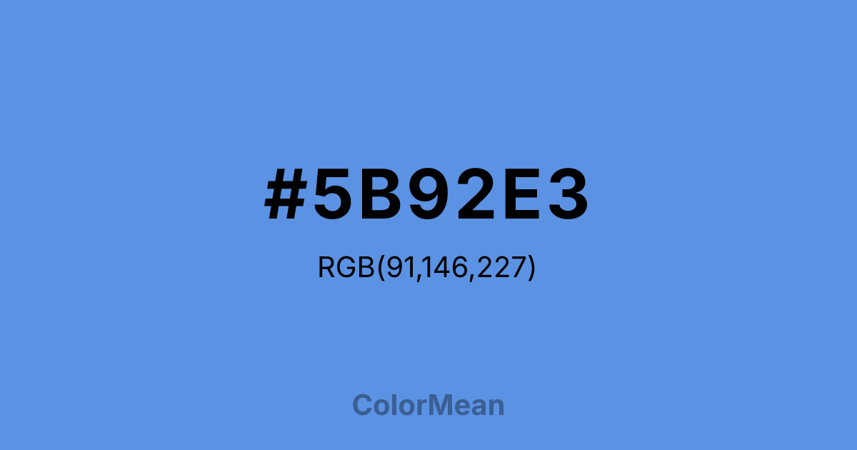
#5B92E3 Color Information
#5B92E3 RGB value is (91, 146, 227). The hex color red value is 91, green is 146, and blue is 227. Its HSL format shows a hue of 216°, saturation of 71 percent, and lightness of 62 percent. The CMYK process values are 60 percent, 36 percent, 0 percent, 11 percent.
#5B92E3 Color Meaning
Color #5B92E3 symbolizes peace, communication, and global unity. #5B92E3 medium, vivid blue communicates clarity, trust, and diplomacy. Psychologically, color #5B92E3 fosters calm engagement, cooperation, and logical problem-solving, ideal for collaborative and international contexts. Culturally, #5B92E3 reflects authority, reliability, and neutrality in Western traditions, especially linked to international organizations. Eastern traditions associate blue with wisdom, clarity, and emotional balance. Feng Shui considers #5B92E3 shade beneficial for communication, social interaction, and career areas, encouraging harmony and understanding. Spiritually, #5B92E3 resonates with the throat chakra, enhancing effective expression, truthfulness, and dialogue. In design, color #5B92E3 functions well in logos, websites, and organizational branding. Its vivid, balanced tone conveys professionalism and optimism while remaining approachable. Artists use #5B92E3 to depict sky, water, and serene backgrounds, supporting calm and clarity in compositions.
Color Conversion
Convert #5B92E3 across different color models and formats. These conversions help designers work seamlessly between digital and print media, ensuring this color maintains its intended appearance across RGB screens, CMYK printers, and HSL color manipulations.
RGB Values & CMYK Values
RGB Values
CMYK Values
Color Variations
#5B92E3 harmonies come to life through carefully balanced shades, tints, and tones, giving this color depth and flexibility across light and dark variations. Shades add richness, tints bring an airy softness, and tones soften intensity, making it easy to pair in clean, modern palettes.
Color Harmonies
#5B92E3 harmonies create beautiful relationships with other colors based on their position on the color wheel. Each harmony type offers unique design possibilities, enabling cohesive and visually appealing color schemes.
Analogous
Colors adjacent on the color wheel (30° apart)
Complementary
Colors opposite on the color wheel (180° apart)
Split Complementary
Three colors using one base hue and the two hues beside its opposite
Triadic
Three colors evenly spaced (120° apart)
Tetradic
Four colors forming a rectangle on the wheel
Square
Four colors evenly spaced (90° apart)
Double Split
Four colors formed from two base hues and the colors next to their opposites
Monochromatic
Variations of a single hue
Contrast Checker
(WCAG 2.1) Test #5B92E3 for accessibility compliance against white and black backgrounds. Proper contrast ensures this color remains readable and usable for all audiences, meeting WCAG 2.1 standards for both normal and large text applications.
Sample Text
This is how your text will look with these colors.
Large Text (18pt+)
Normal Text
UI Components
Color Blindness Simulator
See how #5B92E3 appears to people with different types of color vision deficiencies. These simulations help create more inclusive designs that consider how this color is perceived across various visual abilities.
Normal Vision
protanopia
Note: These simulations are approximations. Actual color vision deficiency varies by individual.
CSS Examples
Background Color
Text Color
Sample Text
Border Color
Box Shadow
Text Shadow
Sample Text
Gradient
#5B92E3 Color FAQs
Frequently asked questions about #5B92E3 color meaning, symbolism, and applications. Click on any question to expand detailed answers.
