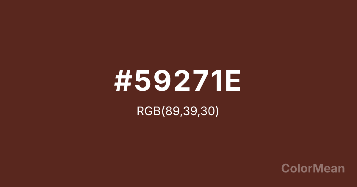
#59271E Color Information
#59271E RGB value is (89, 39, 30). The hex color red value is 89, green is 39, and blue is 30. Its HSL format shows a hue of 9°, saturation of 50 percent, and lightness of 23 percent. The CMYK process values are 0 percent, 56 percent, 66 percent, 65 percent.
#59271E Color Meaning
Color #59271E signifies historical gravity, alchemical transformation, and earthbound solemnity. Color #59271E—Latin for “death’s head”—is a deep, slightly purplish brown historically derived from iron oxide residue in alchemy labs. Its name and origin tie #59271E to transformation through decay, making #59271E a pigment of paradox: #59271E emerges from waste but carries noble depth. In art conservation, #59271E appears in 18th-century portraiture to convey mortality and humility. Psychologically, such rich browns signal introspection, maturity, and acceptance of life’s cycles—unlike reds that protest, color #59271E observes. In contemporary design, color #59271E functions as a sophisticated alternative to black in typography and luxury packaging. #59271E absorbs light rather than reflects #59271E, creating tactile depth on matte surfaces. Studies on consumer perception show that products framed in deep earth tones like color #59271E are rated as more artisanal and thoughtful than those in stark neutrals. #59271E pairs powerfully with antique golds or parchment whites, evoking archival elegance without nostalgia. Digital use requires care—#59271E can appear muddy on low-brightness screens—but when calibrated, #59271E adds gravitas without gloom. Culturally, color #59271E reflects the beauty of impermanence: rust, aged leather, dried blood. #59271E appears in memorial design, historical documentaries, and slow-fashion branding as a symbol of integrity through time. Spiritually, #59271E connects to the root chakra’s grounded aspect—not survival, but dignified presence. Designers use color #59271E when silence speaks louder than color. #59271E does not attract attention; #59271E commands respect through stillness.
Color Conversion
Convert #59271E across different color models and formats. These conversions help designers work seamlessly between digital and print media, ensuring this color maintains its intended appearance across RGB screens, CMYK printers, and HSL color manipulations.
RGB Values & CMYK Values
RGB Values
CMYK Values
Color Variations
#59271E harmonies come to life through carefully balanced shades, tints, and tones, giving this color depth and flexibility across light and dark variations. Shades add richness, tints bring an airy softness, and tones soften intensity, making it easy to pair in clean, modern palettes.
Color Harmonies
#59271E harmonies create beautiful relationships with other colors based on their position on the color wheel. Each harmony type offers unique design possibilities, enabling cohesive and visually appealing color schemes.
Analogous
Colors adjacent on the color wheel (30° apart)
Complementary
Colors opposite on the color wheel (180° apart)
Split Complementary
Three colors using one base hue and the two hues beside its opposite
Triadic
Three colors evenly spaced (120° apart)
Tetradic
Four colors forming a rectangle on the wheel
Square
Four colors evenly spaced (90° apart)
Double Split
Four colors formed from two base hues and the colors next to their opposites
Monochromatic
Variations of a single hue
Contrast Checker
(WCAG 2.1) Test #59271E for accessibility compliance against white and black backgrounds. Proper contrast ensures this color remains readable and usable for all audiences, meeting WCAG 2.1 standards for both normal and large text applications.
Sample Text
This is how your text will look with these colors.
Large Text (18pt+)
Normal Text
UI Components
Color Blindness Simulator
See how #59271E appears to people with different types of color vision deficiencies. These simulations help create more inclusive designs that consider how this color is perceived across various visual abilities.
Normal Vision
protanopia
Note: These simulations are approximations. Actual color vision deficiency varies by individual.
CSS Examples
Background Color
Text Color
Sample Text
Border Color
Box Shadow
Text Shadow
Sample Text
Gradient
#59271E Color FAQs
Frequently asked questions about #59271E color meaning, symbolism, and applications. Click on any question to expand detailed answers.
