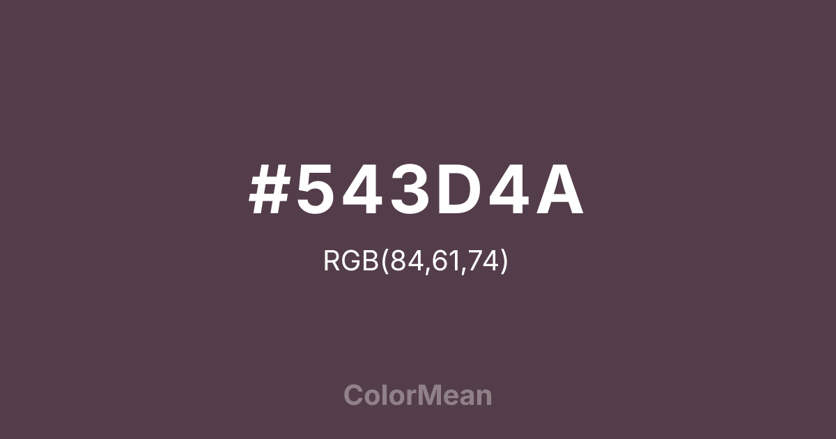
#543D4A Color Information
#543D4A RGB value is (84, 61, 74). The hex color red value is 84, green is 61, and blue is 74. Its HSL format shows a hue of 326°, saturation of 16 percent, and lightness of 28 percent. The CMYK process values are 0 percent, 27 percent, 12 percent, 67 percent.
#543D4A Color Meaning
Color #543D4A signifies earthy mystery, sophisticated neutrality, and complex grounding. #543D4A dark, greyish purple-brown is a muted, elegant blend, resembling wet stones, dark roasted coffee beans, or shadows in a forest at night. Psychologically, color #543D4A is deeply stabilizing and subtly intriguing, promoting a sense of organic sophistication, resilient calm, and a connection to the profound, quiet complexity of the natural world. #543D4A is a neutral that carries a narrative of depth and weathered experience. #543D4A color is the soil of mystery. Symbolically, color #543D4A represents the point where the mystical (purple) returns to the earth (taupe), wisdom that is grounded, and beauty found in rich, ambiguous shadows. #543D4A is the color of an intellectual’s well-worn study or the bark of an ancient tree. Culturally, #543D4A is a favorite in high-end interior design and fashion for its ability to provide a dark, warm neutral that is far more interesting and emotionally resonant than plain black or brown, suggesting taste, depth, and a quiet confidence.
Color Conversion
Convert #543D4A across different color models and formats. These conversions help designers work seamlessly between digital and print media, ensuring this color maintains its intended appearance across RGB screens, CMYK printers, and HSL color manipulations.
RGB Values & CMYK Values
RGB Values
CMYK Values
Color Variations
#543D4A harmonies come to life through carefully balanced shades, tints, and tones, giving this color depth and flexibility across light and dark variations. Shades add richness, tints bring an airy softness, and tones soften intensity, making it easy to pair in clean, modern palettes.
Color Harmonies
#543D4A harmonies create beautiful relationships with other colors based on their position on the color wheel. Each harmony type offers unique design possibilities, enabling cohesive and visually appealing color schemes.
Analogous
Colors adjacent on the color wheel (30° apart)
Complementary
Colors opposite on the color wheel (180° apart)
Split Complementary
Three colors using one base hue and the two hues beside its opposite
Triadic
Three colors evenly spaced (120° apart)
Tetradic
Four colors forming a rectangle on the wheel
Square
Four colors evenly spaced (90° apart)
Double Split
Four colors formed from two base hues and the colors next to their opposites
Monochromatic
Variations of a single hue
Contrast Checker
(WCAG 2.1) Test #543D4A for accessibility compliance against white and black backgrounds. Proper contrast ensures this color remains readable and usable for all audiences, meeting WCAG 2.1 standards for both normal and large text applications.
Sample Text
This is how your text will look with these colors.
Large Text (18pt+)
Normal Text
UI Components
Color Blindness Simulator
See how #543D4A appears to people with different types of color vision deficiencies. These simulations help create more inclusive designs that consider how this color is perceived across various visual abilities.
Normal Vision
protanopia
Note: These simulations are approximations. Actual color vision deficiency varies by individual.
CSS Examples
Background Color
Text Color
Sample Text
Border Color
Box Shadow
Text Shadow
Sample Text
Gradient
#543D4A Color FAQs
Frequently asked questions about #543D4A color meaning, symbolism, and applications. Click on any question to expand detailed answers.

