#50C879 Color Information
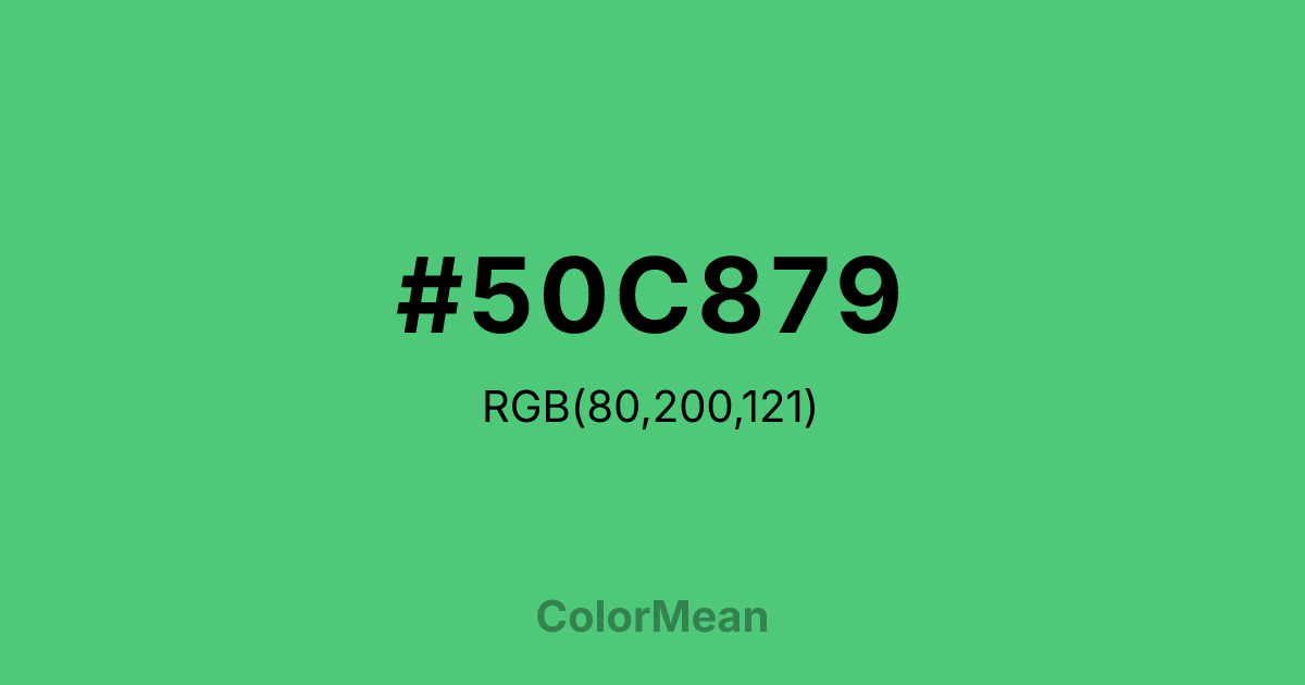
#50C879 RGB value is (80, 200, 121). The hex color red value is 80, green is 200, and blue is 121. Its HSL format shows a hue of 141°, saturation of 52 percent, and lightness of 55 percent. The CMYK process values are 60 percent, 0 percent, 40 percent, 22 percent.
#50C879 Color Meaning
Color #50C879 denotes historical toxicity, seductive danger, and artificial allure. #50C879 bright, yellowish-green is famously known as a potent arsenic-based pigment used in wallpapers and paints, carrying a legacy of beauty intertwined with poison. Psychologically, color #50C879 is complex, simultaneously attractive and unsettling. #50C879 stimulates with its vivid, artificial verdancy while subconsciously hinting at risk and deception. #50C879 color embodies the aesthetic appeal of the unnatural and the human desire to replicate nature's brilliance at any cost. Culturally, color #50C879 is steeped in Victorian history, art, and forensic science, representing an era of technological progress shadowed by hidden peril. Symbolically, #50C879 stands for seductive danger, toxic beauty, and the Faustian bargain of artificial creation. In modern contexts, color #50C879 can be used to evoke a specific historical period or to create a deliberately provocative, edgy vibrancy that acknowledges its own potentially jarring artificiality.
Color Conversion
Convert #50C879 across different color models and formats. These conversions help designers work seamlessly between digital and print media, ensuring this color maintains its intended appearance across RGB screens, CMYK printers, and HSL color manipulations.
RGB Values & CMYK Values
RGB Values
CMYK Values
Color Variations
#50C879 harmonies come to life through carefully balanced shades, tints, and tones, giving this color depth and flexibility across light and dark variations. Shades add richness, tints bring an airy softness, and tones soften intensity, making it easy to pair in clean, modern palettes.
Color Harmonies
#50C879 harmonies create beautiful relationships with other colors based on their position on the color wheel. Each harmony type offers unique design possibilities, enabling cohesive and visually appealing color schemes.
Analogous
Colors adjacent on the color wheel (30° apart)
Complementary
Colors opposite on the color wheel (180° apart)
Split Complementary
Three colors using one base hue and the two hues beside its opposite
Triadic
Three colors evenly spaced (120° apart)
Tetradic
Four colors forming a rectangle on the wheel
Square
Four colors evenly spaced (90° apart)
Double Split
Four colors formed from two base hues and the colors next to their opposites
Monochromatic
Variations of a single hue
Contrast Checker
(WCAG 2.1) Test #50C879 for accessibility compliance against white and black backgrounds. Proper contrast ensures this color remains readable and usable for all audiences, meeting WCAG 2.1 standards for both normal and large text applications.
Sample Text
This is how your text will look with these colors.
Large Text (18pt+)
Normal Text
UI Components
Color Blindness Simulator
See how #50C879 appears to people with different types of color vision deficiencies. These simulations help create more inclusive designs that consider how this color is perceived across various visual abilities.
Normal Vision
protanopia
Note: These simulations are approximations. Actual color vision deficiency varies by individual.
CSS Examples
Background Color
Text Color
Sample Text
Border Color
Box Shadow
Text Shadow
Sample Text
Gradient
#50C879 Color FAQs
Frequently asked questions about #50C879 color meaning, symbolism, and applications. Click on any question to expand detailed answers.

