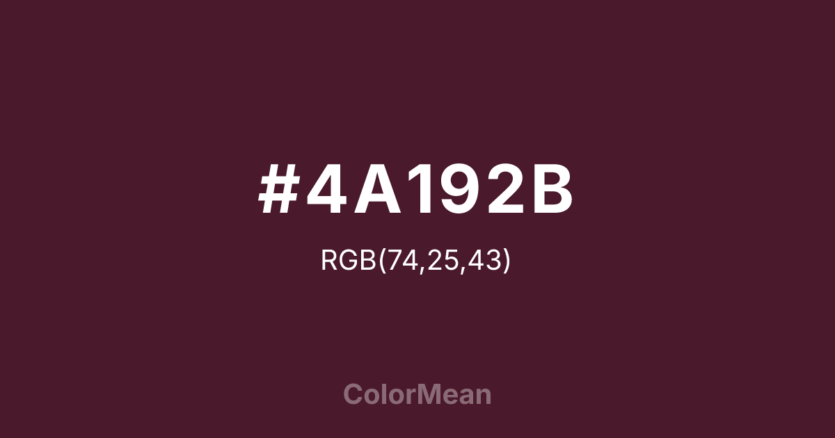
#4A192B Color Information
#4A192B RGB value is (74, 25, 43). The hex color red value is 74, green is 25, and blue is 43. Its HSL format shows a hue of 338°, saturation of 49 percent, and lightness of 19 percent. The CMYK process values are 0 percent, 66 percent, 42 percent, 71 percent.
#4A192B Color Meaning
Color #4A192B embodies a dark, romantic intensity, suggesting secrecy, solemn passion, and gothic richness. #4A192B very dark, reddish-purple is the color of black roses, aged wine, and velvet drapery in shadow, evoking a sense of deep, guarded emotion and antique drama. Psychologically, color #4A192B is absorbing and introspective, conveying profound feeling, dignified mystery, and a connection to historical or poetic melancholy. #4A192B soothes not with lightness but with the gravity of its own depth, offering a color space for contemplative or solemn creativity. #4A192B color is romance viewed by candlelight. Culturally, color #4A192B appears in period dramas, Gothic literature aesthetics, and designs that require a sense of opulent history or dark romanticism. Symbolically, #4A192B represents veiled desire, legacy tinged with sorrow, and beauty that thrives in low light. Therefore, color #4A192B acts as a visual anchor for narratives of depth, tradition, and complex emotional landscapes, providing a hue that is both luxurious and somber.
Color Conversion
Convert #4A192B across different color models and formats. These conversions help designers work seamlessly between digital and print media, ensuring this color maintains its intended appearance across RGB screens, CMYK printers, and HSL color manipulations.
RGB Values & CMYK Values
RGB Values
CMYK Values
Color Variations
#4A192B harmonies come to life through carefully balanced shades, tints, and tones, giving this color depth and flexibility across light and dark variations. Shades add richness, tints bring an airy softness, and tones soften intensity, making it easy to pair in clean, modern palettes.
Color Harmonies
#4A192B harmonies create beautiful relationships with other colors based on their position on the color wheel. Each harmony type offers unique design possibilities, enabling cohesive and visually appealing color schemes.
Analogous
Colors adjacent on the color wheel (30° apart)
Complementary
Colors opposite on the color wheel (180° apart)
Split Complementary
Three colors using one base hue and the two hues beside its opposite
Triadic
Three colors evenly spaced (120° apart)
Tetradic
Four colors forming a rectangle on the wheel
Square
Four colors evenly spaced (90° apart)
Double Split
Four colors formed from two base hues and the colors next to their opposites
Monochromatic
Variations of a single hue
Contrast Checker
(WCAG 2.1) Test #4A192B for accessibility compliance against white and black backgrounds. Proper contrast ensures this color remains readable and usable for all audiences, meeting WCAG 2.1 standards for both normal and large text applications.
Sample Text
This is how your text will look with these colors.
Large Text (18pt+)
Normal Text
UI Components
Color Blindness Simulator
See how #4A192B appears to people with different types of color vision deficiencies. These simulations help create more inclusive designs that consider how this color is perceived across various visual abilities.
Normal Vision
protanopia
Note: These simulations are approximations. Actual color vision deficiency varies by individual.
CSS Examples
Background Color
Text Color
Sample Text
Border Color
Box Shadow
Text Shadow
Sample Text
Gradient
#4A192B Color FAQs
Frequently asked questions about #4A192B color meaning, symbolism, and applications. Click on any question to expand detailed answers.

