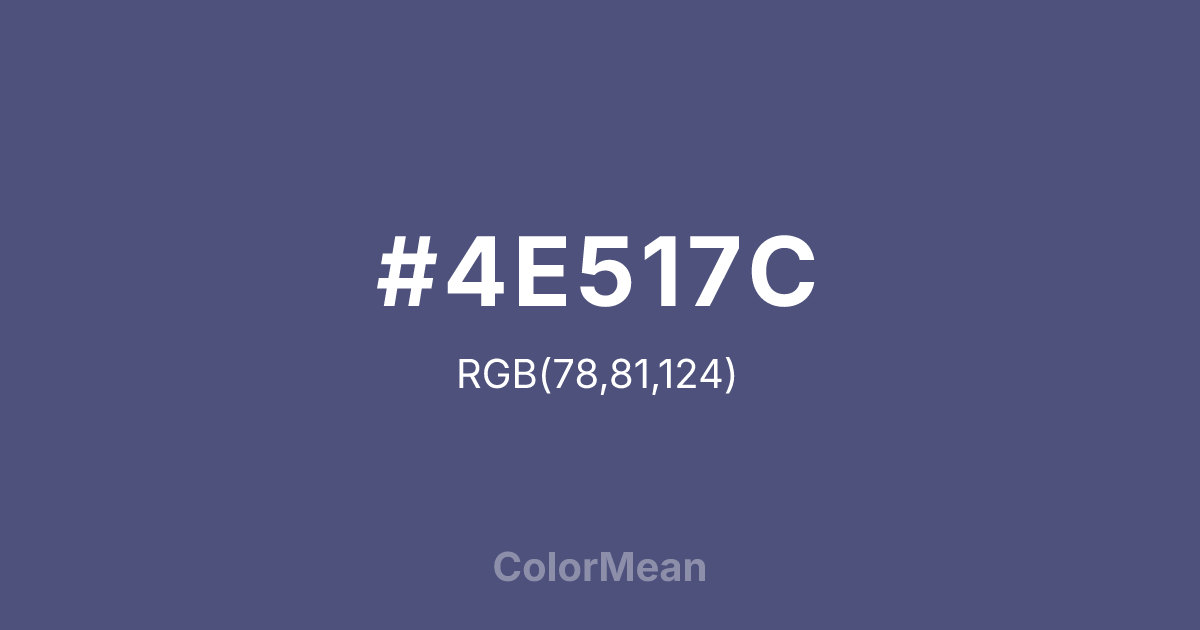
#4E517C Color Information
#4E517C RGB value is (78, 81, 124). The hex color red value is 78, green is 81, and blue is 124. Its HSL format shows a hue of 236°, saturation of 23 percent, and lightness of 40 percent. The CMYK process values are 37 percent, 35 percent, 0 percent, 51 percent.
#4E517C Color Meaning
Color #4E517C signifies disciplined depth, intellectual mystery, and nautical authority. #4E517C dark, desaturated blue-purple is the color of deep ocean trenches, twilight on a naval ship, and scholarly robes in certain traditions. Psychologically, color #4E517C is cool, contemplative, and authoritative, promoting focused thought, strategic calm, and a sense of navigating complex, profound systems. #4E517C combines the stability of navy blue with the intuitive depth of purple, creating a tone of serious, knowledgeable power. #4E517C color is the mind exploring deep waters. Symbolically, color #4E517C represents the knowledge of the abyss, the discipline of the night watch, and wisdom that is both academic and experiential. #4E517C is the color of a captain’s log or a philosopher’s deepest treatise. Culturally, #4E517C appears in institutional branding, military insignia, and academic regalia where a sense of reserved, profound authority is required. Color #4E517C offers a sophisticated, somber alternative to pure navy, infused with a hint of thoughtful, mysterious depth.
Color Conversion
Convert #4E517C across different color models and formats. These conversions help designers work seamlessly between digital and print media, ensuring this color maintains its intended appearance across RGB screens, CMYK printers, and HSL color manipulations.
RGB Values & CMYK Values
RGB Values
CMYK Values
Color Variations
#4E517C harmonies come to life through carefully balanced shades, tints, and tones, giving this color depth and flexibility across light and dark variations. Shades add richness, tints bring an airy softness, and tones soften intensity, making it easy to pair in clean, modern palettes.
Color Harmonies
#4E517C harmonies create beautiful relationships with other colors based on their position on the color wheel. Each harmony type offers unique design possibilities, enabling cohesive and visually appealing color schemes.
Analogous
Colors adjacent on the color wheel (30° apart)
Complementary
Colors opposite on the color wheel (180° apart)
Split Complementary
Three colors using one base hue and the two hues beside its opposite
Triadic
Three colors evenly spaced (120° apart)
Tetradic
Four colors forming a rectangle on the wheel
Square
Four colors evenly spaced (90° apart)
Double Split
Four colors formed from two base hues and the colors next to their opposites
Monochromatic
Variations of a single hue
Contrast Checker
(WCAG 2.1) Test #4E517C for accessibility compliance against white and black backgrounds. Proper contrast ensures this color remains readable and usable for all audiences, meeting WCAG 2.1 standards for both normal and large text applications.
Sample Text
This is how your text will look with these colors.
Large Text (18pt+)
Normal Text
UI Components
Color Blindness Simulator
See how #4E517C appears to people with different types of color vision deficiencies. These simulations help create more inclusive designs that consider how this color is perceived across various visual abilities.
Normal Vision
protanopia
Note: These simulations are approximations. Actual color vision deficiency varies by individual.
CSS Examples
Background Color
Text Color
Sample Text
Border Color
Box Shadow
Text Shadow
Sample Text
Gradient
#4E517C Color FAQs
Frequently asked questions about #4E517C color meaning, symbolism, and applications. Click on any question to expand detailed answers.

