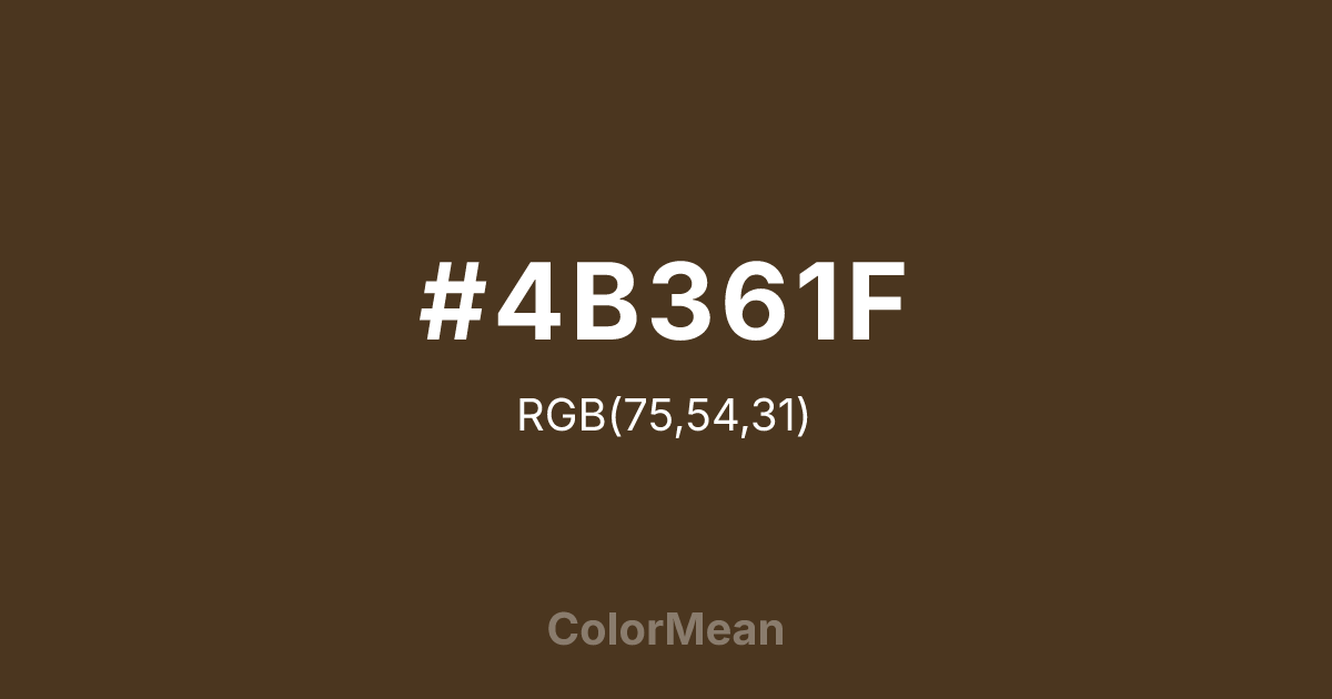
#4B361F Color Information
#4B361F RGB value is (75, 54, 31). The hex color red value is 75, green is 54, and blue is 31. Its HSL format shows a hue of 31°, saturation of 42 percent, and lightness of 21 percent. The CMYK process values are 0 percent, 28 percent, 59 percent, 71 percent.
#4B361F Color Meaning
Color #4B361F signifies concentrated depth, introspective richness, and artisanal gravity. Color #4B361F is the color of espresso grounds, dark chocolate, and unvarnished walnut—dense, complex, and slightly bitter. Unlike black, #4B361F retains texture and temperature, making #4B361F feel more intimate than austere. In branding, color #4B361F signals craftsmanship: #4B361F appears in gourmet food, boutique publishing, and luxury accessories where heritage matters. Psychological research shows that deep browns like color #4B361F evoke feelings of reliability and substance, especially when contrasted with lighter neutrals. Architecturally, color #4B361F grounds modern spaces by adding organic weight. #4B361F works well in small doses—door frames, furniture edges, or typography—where #4B361F provides visual anchor without overwhelming. Unlike cooler darks, its red undertone prevents sterility, maintaining warmth even in minimal settings. In digital interfaces, color #4B361F serves as a sophisticated alternative to black for text or borders, reducing glare while preserving readability. User testing confirms higher comfort levels with deep browns over pure black in long-form reading. Symbolically, color #4B361F represents depth earned through time—like aged whiskey or well-read books. #4B361F is not flashy but reveals complexity upon closer inspection. In spiritual practice, #4B361F connects to the earth element: stability, nourishment, and quiet strength. Designers use color #4B361F when they want to imply maturity without rigidity. Its richness whispers rather than shouts, making #4B361F a chromatic choice for those who value substance over spectacle.
Color Conversion
Convert #4B361F across different color models and formats. These conversions help designers work seamlessly between digital and print media, ensuring this color maintains its intended appearance across RGB screens, CMYK printers, and HSL color manipulations.
RGB Values & CMYK Values
RGB Values
CMYK Values
Color Variations
#4B361F harmonies come to life through carefully balanced shades, tints, and tones, giving this color depth and flexibility across light and dark variations. Shades add richness, tints bring an airy softness, and tones soften intensity, making it easy to pair in clean, modern palettes.
Color Harmonies
#4B361F harmonies create beautiful relationships with other colors based on their position on the color wheel. Each harmony type offers unique design possibilities, enabling cohesive and visually appealing color schemes.
Analogous
Colors adjacent on the color wheel (30° apart)
Complementary
Colors opposite on the color wheel (180° apart)
Split Complementary
Three colors using one base hue and the two hues beside its opposite
Triadic
Three colors evenly spaced (120° apart)
Tetradic
Four colors forming a rectangle on the wheel
Square
Four colors evenly spaced (90° apart)
Double Split
Four colors formed from two base hues and the colors next to their opposites
Monochromatic
Variations of a single hue
Contrast Checker
(WCAG 2.1) Test #4B361F for accessibility compliance against white and black backgrounds. Proper contrast ensures this color remains readable and usable for all audiences, meeting WCAG 2.1 standards for both normal and large text applications.
Sample Text
This is how your text will look with these colors.
Large Text (18pt+)
Normal Text
UI Components
Color Blindness Simulator
See how #4B361F appears to people with different types of color vision deficiencies. These simulations help create more inclusive designs that consider how this color is perceived across various visual abilities.
Normal Vision
protanopia
Note: These simulations are approximations. Actual color vision deficiency varies by individual.
CSS Examples
Background Color
Text Color
Sample Text
Border Color
Box Shadow
Text Shadow
Sample Text
Gradient
#4B361F Color FAQs
Frequently asked questions about #4B361F color meaning, symbolism, and applications. Click on any question to expand detailed answers.
