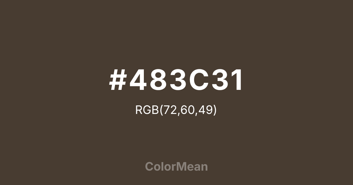
#483C31 Color Information
#483C31 RGB value is (72, 60, 49). The hex color red value is 72, green is 60, and blue is 49. Its HSL format shows a hue of 29°, saturation of 19 percent, and lightness of 24 percent. The CMYK process values are 0 percent, 17 percent, 32 percent, 72 percent.
#483C31 Color Meaning
Color #483C31 signifies calm stability, natural warmth, and earthy sophistication. #483C31 dark brown-grey shade encourages groundedness and introspective composure. Color #483C31 psychologically promotes emotional steadiness, patience, and practical thinking, making #483C31 a stabilizing influence in personal and professional environments. In Western culture, color #483C31 embodies timeless elegance, commonly applied in interior design, fashion, and furniture for its neutral yet luxurious undertone. Eastern traditions value #483C31 as a grounding, harmonious shade, encouraging connection with nature and mindful presence. Fengshui uses #483C31 to anchor spaces and balance energy flow. Spiritually, color #483C31 aligns with the Root Chakra, fostering secure grounding, resilience, and physical stability. Designers leverage #483C31 in muted palettes, natural textures, and layered compositions. Its dark, understated tone adds depth and sophistication without dominating surrounding colors.
Color Conversion
Convert #483C31 across different color models and formats. These conversions help designers work seamlessly between digital and print media, ensuring this color maintains its intended appearance across RGB screens, CMYK printers, and HSL color manipulations.
RGB Values & CMYK Values
RGB Values
CMYK Values
Color Variations
#483C31 harmonies come to life through carefully balanced shades, tints, and tones, giving this color depth and flexibility across light and dark variations. Shades add richness, tints bring an airy softness, and tones soften intensity, making it easy to pair in clean, modern palettes.
Color Harmonies
#483C31 harmonies create beautiful relationships with other colors based on their position on the color wheel. Each harmony type offers unique design possibilities, enabling cohesive and visually appealing color schemes.
Analogous
Colors adjacent on the color wheel (30° apart)
Complementary
Colors opposite on the color wheel (180° apart)
Split Complementary
Three colors using one base hue and the two hues beside its opposite
Triadic
Three colors evenly spaced (120° apart)
Tetradic
Four colors forming a rectangle on the wheel
Square
Four colors evenly spaced (90° apart)
Double Split
Four colors formed from two base hues and the colors next to their opposites
Monochromatic
Variations of a single hue
Contrast Checker
(WCAG 2.1) Test #483C31 for accessibility compliance against white and black backgrounds. Proper contrast ensures this color remains readable and usable for all audiences, meeting WCAG 2.1 standards for both normal and large text applications.
Sample Text
This is how your text will look with these colors.
Large Text (18pt+)
Normal Text
UI Components
Color Blindness Simulator
See how #483C31 appears to people with different types of color vision deficiencies. These simulations help create more inclusive designs that consider how this color is perceived across various visual abilities.
Normal Vision
protanopia
Note: These simulations are approximations. Actual color vision deficiency varies by individual.
CSS Examples
Background Color
Text Color
Sample Text
Border Color
Box Shadow
Text Shadow
Sample Text
Gradient
#483C31 Color FAQs
Frequently asked questions about #483C31 color meaning, symbolism, and applications. Click on any question to expand detailed answers.

