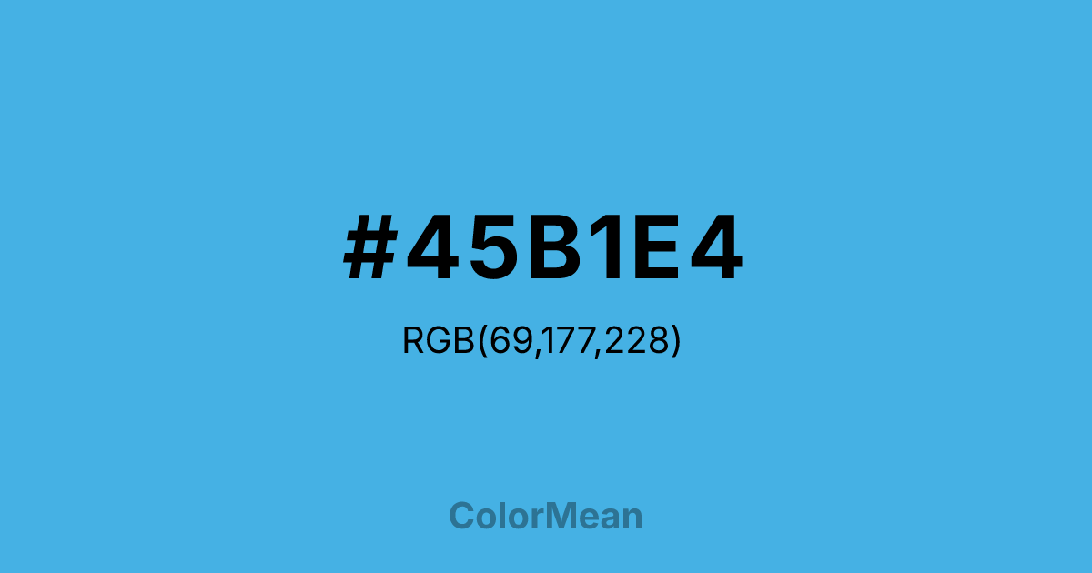
#45B1E4 Color Information
#45B1E4 RGB value is (69, 177, 228). The hex color red value is 69, green is 177, and blue is 228. Its HSL format shows a hue of 199°, saturation of 75 percent, and lightness of 58 percent. The CMYK process values are 70 percent, 22 percent, 0 percent, 11 percent.
#45B1E4 Color Meaning
Color #45B1E4 projects cheerful clarity, optimistic openness, and digital friendliness. #45B1E4 bright, light azure is reminiscent of a cloudless midday sky, swimming pool mosaics, and friendly app icons. Psychologically, color #45B1E4 is invigorating and mentally refreshing, promoting feelings of clear communication, positive energy, and uncluttered thought. #45B1E4 is a color of accessible technology and modern optimism, often used to convey reliability, approachability, and clean, efficient service. #45B1E4 color feels both professional and warmly inviting. Culturally, color #45B1E4 is prevalent in corporate branding, social media interfaces, and healthcare communication, symbolizing trust, transparency, and a forward-thinking attitude. Symbolically, #45B1E4 represents a clear channel, an open line of communication, and horizons that are bright and within reach. Therefore, color #45B1E4 acts as a visual standard for positive digital interaction, bridging the gap between human warmth and technological precision with its crisp, cheerful tone.
Color Conversion
Convert #45B1E4 across different color models and formats. These conversions help designers work seamlessly between digital and print media, ensuring this color maintains its intended appearance across RGB screens, CMYK printers, and HSL color manipulations.
RGB Values & CMYK Values
RGB Values
CMYK Values
Color Variations
#45B1E4 harmonies come to life through carefully balanced shades, tints, and tones, giving this color depth and flexibility across light and dark variations. Shades add richness, tints bring an airy softness, and tones soften intensity, making it easy to pair in clean, modern palettes.
Color Harmonies
#45B1E4 harmonies create beautiful relationships with other colors based on their position on the color wheel. Each harmony type offers unique design possibilities, enabling cohesive and visually appealing color schemes.
Analogous
Colors adjacent on the color wheel (30° apart)
Complementary
Colors opposite on the color wheel (180° apart)
Split Complementary
Three colors using one base hue and the two hues beside its opposite
Triadic
Three colors evenly spaced (120° apart)
Tetradic
Four colors forming a rectangle on the wheel
Square
Four colors evenly spaced (90° apart)
Double Split
Four colors formed from two base hues and the colors next to their opposites
Monochromatic
Variations of a single hue
Contrast Checker
(WCAG 2.1) Test #45B1E4 for accessibility compliance against white and black backgrounds. Proper contrast ensures this color remains readable and usable for all audiences, meeting WCAG 2.1 standards for both normal and large text applications.
Sample Text
This is how your text will look with these colors.
Large Text (18pt+)
Normal Text
UI Components
Color Blindness Simulator
See how #45B1E4 appears to people with different types of color vision deficiencies. These simulations help create more inclusive designs that consider how this color is perceived across various visual abilities.
Normal Vision
protanopia
Note: These simulations are approximations. Actual color vision deficiency varies by individual.
CSS Examples
Background Color
Text Color
Sample Text
Border Color
Box Shadow
Text Shadow
Sample Text
Gradient
#45B1E4 Color FAQs
Frequently asked questions about #45B1E4 color meaning, symbolism, and applications. Click on any question to expand detailed answers.

