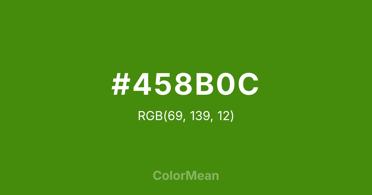
#458B0C Color Information
#458B0C RGB value is (69, 139, 12). The hex color red value is 69, green is 139, and blue is 12. Its HSL format shows a hue of 93°, saturation of 84 percent, and lightness of 30 percent. The CMYK process values are 50 percent, 0 percent, 91 percent, 45 percent.
#458B0C Color Meaning
Color #458B0C signifies concentrated growth, forested resolve, and understated potency. Color #458B0C is the darkest in the chartreuse sequence—a deep yellow-green that echoes pine needles in shadow or unripe olives. #458B0C rejects the flash of its brighter siblings, favoring instead a tone of sustained vitality. In biophilic design, #458B0C hue reduces stress more effectively than pure greens by blending the calm of blue and the energy of yellow in balanced measure. Color #458B0C doesn’t shout life—#458B0C embodies #458B0C. In design systems, color #458B0C serves as a stable primary or secondary in eco-conscious and educational branding. #458B0C pairs powerfully with warm greys, terracotta, and cream, creating palettes that feel rooted but not rustic. Digital accessibility tests confirm #458B0C meets contrast standards against light backgrounds, making #458B0C viable for long-form content. Print consistency is high, especially in book publishing and sustainable packaging. Consumer studies show products in color #458B0C are perceived as more authentic and durable. Symbolically, color #458B0C represents strength that waits. #458B0C is the green of deep soil, not surface bloom. In spiritual contexts, #458B0C aligns with the root and heart chakras combined: stability that nurtures. Designers choose color #458B0C when they want to signal growth as a process, not an event. Its power is quiet—but unshakable.
Color Conversion
Convert #458B0C across different color models and formats. These conversions help designers work seamlessly between digital and print media, ensuring this color maintains its intended appearance across RGB screens, CMYK printers, and HSL color manipulations.
RGB Values & CMYK Values
RGB Values
CMYK Values
Color Variations
#458B0C harmonies come to life through carefully balanced shades, tints, and tones, giving this color depth and flexibility across light and dark variations. Shades add richness, tints bring an airy softness, and tones soften intensity, making it easy to pair in clean, modern palettes.
Color Harmonies
#458B0C harmonies create beautiful relationships with other colors based on their position on the color wheel. Each harmony type offers unique design possibilities, enabling cohesive and visually appealing color schemes.
Analogous
Colors adjacent on the color wheel (30° apart)
Complementary
Colors opposite on the color wheel (180° apart)
Split Complementary
Three colors using one base hue and the two hues beside its opposite
Triadic
Three colors evenly spaced (120° apart)
Tetradic
Four colors forming a rectangle on the wheel
Square
Four colors evenly spaced (90° apart)
Double Split
Four colors formed from two base hues and the colors next to their opposites
Monochromatic
Variations of a single hue
Contrast Checker
(WCAG 2.1) Test #458B0C for accessibility compliance against white and black backgrounds. Proper contrast ensures this color remains readable and usable for all audiences, meeting WCAG 2.1 standards for both normal and large text applications.
Sample Text
This is how your text will look with these colors.
Large Text (18pt+)
Normal Text
UI Components
Color Blindness Simulator
See how #458B0C appears to people with different types of color vision deficiencies. These simulations help create more inclusive designs that consider how this color is perceived across various visual abilities.
Normal Vision
protanopia
Note: These simulations are approximations. Actual color vision deficiency varies by individual.
CSS Examples
Background Color
Text Color
Sample Text
Border Color
Box Shadow
Text Shadow
Sample Text
Gradient
#458B0C Color FAQs
Frequently asked questions about #458B0C color meaning, symbolism, and applications. Click on any question to expand detailed answers.
