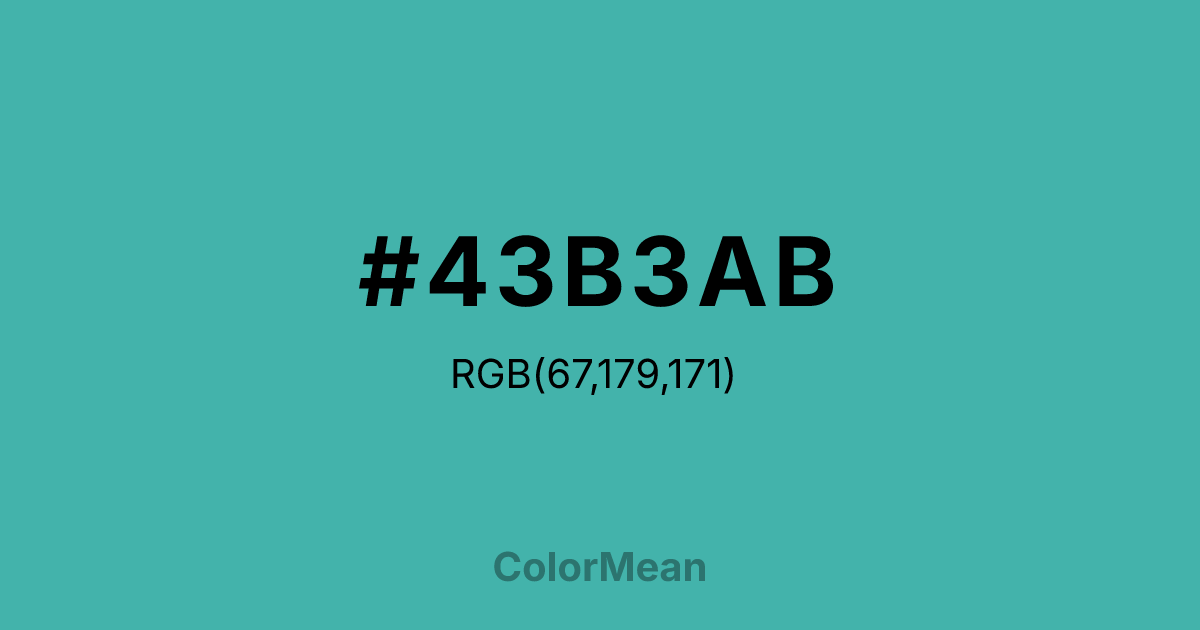
#43B3AB Color Information
#43B3AB RGB value is (67, 179, 171). The hex color red value is 67, green is 179, and blue is 171. Its HSL format shows a hue of 176°, saturation of 46 percent, and lightness of 48 percent. The CMYK process values are 63 percent, 0 percent, 4 percent, 30 percent.
#43B3AB Color Meaning
Color #43B3AB embodies tranquility, sophistication, and natural balance. #43B3AB muted teal shade combines blue and green qualities, suggesting calm, rejuvenation, and subtle growth. Psychologically, color #43B3AB promotes emotional clarity, reduces tension, and encourages reflective thought. Culturally, color #43B3AB has historical significance in art and architecture, associated with aged copper patina and refinement. Western interpretations link #43B3AB with stability and creativity, while Eastern symbolism associates teal shades with healing, renewal, and protective energy. Fengshui views #43B3AB as harmonizing, perfect for meditation areas or spaces meant for calm focus. Spiritually, color #43B3AB corresponds to the Heart and Throat chakras, blending love, communication, and inner balance. #43B3AB is a medium-light greenish-blue shade, bridging restful green and communicative blue. In design and arts, #43B3AB is used for serene landscapes, sophisticated branding, and soothing interiors.
Color Conversion
Convert #43B3AB across different color models and formats. These conversions help designers work seamlessly between digital and print media, ensuring this color maintains its intended appearance across RGB screens, CMYK printers, and HSL color manipulations.
RGB Values & CMYK Values
RGB Values
CMYK Values
Color Variations
#43B3AB harmonies come to life through carefully balanced shades, tints, and tones, giving this color depth and flexibility across light and dark variations. Shades add richness, tints bring an airy softness, and tones soften intensity, making it easy to pair in clean, modern palettes.
Color Harmonies
#43B3AB harmonies create beautiful relationships with other colors based on their position on the color wheel. Each harmony type offers unique design possibilities, enabling cohesive and visually appealing color schemes.
Analogous
Colors adjacent on the color wheel (30° apart)
Complementary
Colors opposite on the color wheel (180° apart)
Split Complementary
Three colors using one base hue and the two hues beside its opposite
Triadic
Three colors evenly spaced (120° apart)
Tetradic
Four colors forming a rectangle on the wheel
Square
Four colors evenly spaced (90° apart)
Double Split
Four colors formed from two base hues and the colors next to their opposites
Monochromatic
Variations of a single hue
Contrast Checker
(WCAG 2.1) Test #43B3AB for accessibility compliance against white and black backgrounds. Proper contrast ensures this color remains readable and usable for all audiences, meeting WCAG 2.1 standards for both normal and large text applications.
Sample Text
This is how your text will look with these colors.
Large Text (18pt+)
Normal Text
UI Components
Color Blindness Simulator
See how #43B3AB appears to people with different types of color vision deficiencies. These simulations help create more inclusive designs that consider how this color is perceived across various visual abilities.
Normal Vision
protanopia
Note: These simulations are approximations. Actual color vision deficiency varies by individual.
CSS Examples
Background Color
Text Color
Sample Text
Border Color
Box Shadow
Text Shadow
Sample Text
Gradient
#43B3AB Color FAQs
Frequently asked questions about #43B3AB color meaning, symbolism, and applications. Click on any question to expand detailed answers.

