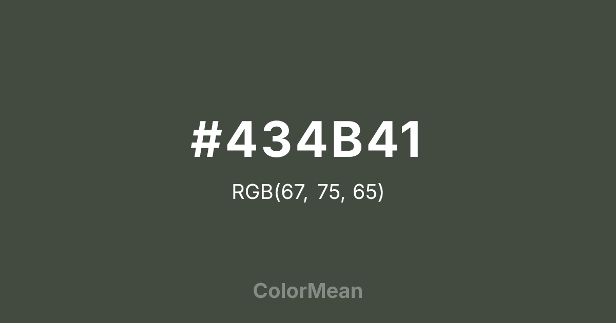
#434B41 Color Information
#434B41 RGB value is (67, 75, 65). The hex color red value is 67, green is 75, and blue is 65. Its HSL format shows a hue of 108°, saturation of 7 percent, and lightness of 27 percent. The CMYK process values are 11 percent, 0 percent, 13 percent, 71 percent.
#434B41 Color Meaning
Color #434B41 conveys steadfastness, subtle authority, and practical reliability. #434B41 slightly darker green evokes natural camouflage and disciplined presence. Psychologically, color #434B41 promotes calm concentration, resilience, and grounded decision-making. #434B41 helps reduce stress while enhancing awareness and composure. Culturally, color #434B41 ties to traditional uniforms, outdoor life, and functional design. Spiritually, #434B41 represents stability, endurance, and careful navigation of complex circumstances.
Color Conversion
Convert #434B41 across different color models and formats. These conversions help designers work seamlessly between digital and print media, ensuring this color maintains its intended appearance across RGB screens, CMYK printers, and HSL color manipulations.
RGB Values & CMYK Values
RGB Values
CMYK Values
Color Variations
#434B41 harmonies come to life through carefully balanced shades, tints, and tones, giving this color depth and flexibility across light and dark variations. Shades add richness, tints bring an airy softness, and tones soften intensity, making it easy to pair in clean, modern palettes.
Color Harmonies
#434B41 harmonies create beautiful relationships with other colors based on their position on the color wheel. Each harmony type offers unique design possibilities, enabling cohesive and visually appealing color schemes.
Analogous
Colors adjacent on the color wheel (30° apart)
Complementary
Colors opposite on the color wheel (180° apart)
Split Complementary
Three colors using one base hue and the two hues beside its opposite
Triadic
Three colors evenly spaced (120° apart)
Tetradic
Four colors forming a rectangle on the wheel
Square
Four colors evenly spaced (90° apart)
Double Split
Four colors formed from two base hues and the colors next to their opposites
Monochromatic
Variations of a single hue
Contrast Checker
(WCAG 2.1) Test #434B41 for accessibility compliance against white and black backgrounds. Proper contrast ensures this color remains readable and usable for all audiences, meeting WCAG 2.1 standards for both normal and large text applications.
Sample Text
This is how your text will look with these colors.
Large Text (18pt+)
Normal Text
UI Components
Color Blindness Simulator
See how #434B41 appears to people with different types of color vision deficiencies. These simulations help create more inclusive designs that consider how this color is perceived across various visual abilities.
Normal Vision
protanopia
Note: These simulations are approximations. Actual color vision deficiency varies by individual.
CSS Examples
Background Color
Text Color
Sample Text
Border Color
Box Shadow
Text Shadow
Sample Text
Gradient
#434B41 Color FAQs
Frequently asked questions about #434B41 color meaning, symbolism, and applications. Click on any question to expand detailed answers.
