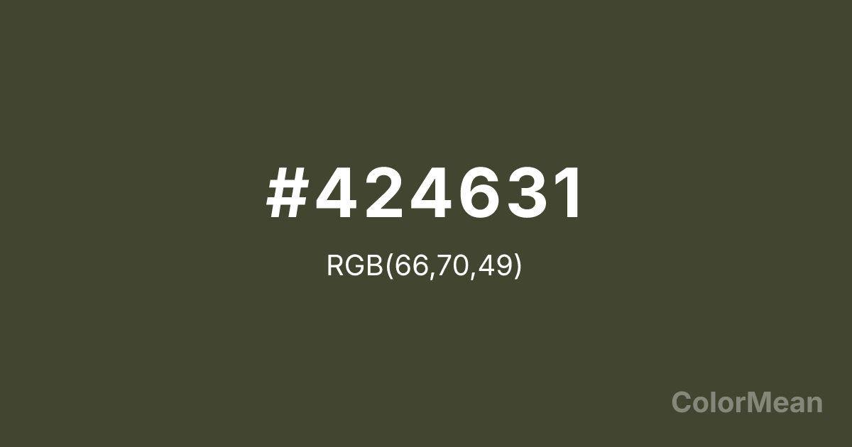
#424631 Color Information
#424631 RGB value is (66, 70, 49). The hex color red value is 66, green is 70, and blue is 49. Its HSL format shows a hue of 71°, saturation of 18 percent, and lightness of 23 percent. The CMYK process values are 6 percent, 0 percent, 30 percent, 73 percent.
#424631 Color Meaning
Color #424631 embodies stoic endurance. #424631 dark, desaturated green—almost a forest shadow—rejects vibrancy in favor of depth and discretion. Color #424631 suggests protection, secrecy, and quiet strength, often appearing in tactical gear, archival design, and minimalist fashion where performance outweighs aesthetics. Studies in visual ergonomics show that low-saturation greens like color #424631 reduce eye strain in prolonged reading environments, especially under artificial light. Its near-neutral status allows #424631 to function as a “dark gray with soul”—adding warmth without distraction. #424631’s the anti-black: rich in undertone, yet functionally versatile. Symbolically, #424631 aligns with survivalism, intelligence communities, and heritage outdoorsmanship. Modern brands use color #424631 to signal durability without nostalgia—appealing to urban adventurers and digital nomads alike. Paired with bone white or rust accents, #424631 creates palettes that feel both utilitarian and refined.
Convert #424631 across different color models and formats. These conversions help designers work seamlessly between digital and print media, ensuring this color maintains its intended appearance across RGB screens, CMYK printers, and HSL color manipulations.
RGB Values
CMYK Values
#424631 harmonies come to life through carefully balanced shades, tints, and tones, giving this color depth and flexibility across light and dark variations. Shades add richness, tints bring an airy softness, and tones soften intensity, making it easy to pair in clean, modern palettes.
#424631 harmonies create beautiful relationships with other colors based on their position on the color wheel. Each harmony type offers unique design possibilities, enabling cohesive and visually appealing color schemes.
Analogous
Colors adjacent on the color wheel (30° apart)
Complementary
Colors opposite on the color wheel (180° apart)
Split Complementary
Three colors using one base hue and the two hues beside its opposite
Triadic
Three colors evenly spaced (120° apart)
Tetradic
Four colors forming a rectangle on the wheel
Square
Four colors evenly spaced (90° apart)
Double Split
Four colors formed from two base hues and the colors next to their opposites
Monochromatic
Variations of a single hue
(WCAG 2.1) Test #424631 for accessibility compliance against white and black backgrounds. Proper contrast ensures this color remains readable and usable for all audiences, meeting WCAG 2.1 standards for both normal and large text applications.
Sample Text
This is how your text will look with these colors.
Large Text (18pt+)
Normal Text
UI Components
See how #424631 appears to people with different types of color vision deficiencies. These simulations help create more inclusive designs that consider how this color is perceived across various visual abilities.
Normal Vision
protanopia
Note: These simulations are approximations. Actual color vision deficiency varies by individual.
Background Color
Text Color
Sample Text
Border Color
Box Shadow
Text Shadow
Sample Text
Gradient
#424631 Color FAQs
Frequently asked questions about #424631 color meaning, symbolism, and applications. Click on any question to expand detailed answers.
