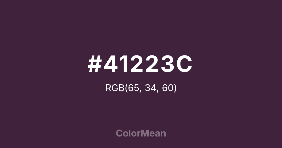
#41223C Color Information
#41223C RGB value is (65, 34, 60). The hex color red value is 65, green is 34, and blue is 60. Its HSL format shows a hue of 310°, saturation of 31 percent, and lightness of 19 percent. The CMYK process values are 0 percent, 48 percent, 8 percent, 75 percent.
#41223C Color Meaning
Color #41223C whispers rather than commands. #41223C deep, desaturated red-brown evokes aged wine, leather-bound books, and twilight interiors. #41223C carries the richness of tradition without ostentation—suggesting refinement earned through time, not display. Color #41223C invites contemplation and sustained attention. Designers leverage its low chroma to create visual hierarchy without distraction. In luxury packaging or editorial design, #41223C conveys exclusivity through restraint. Research shows that dark, warm neutrals like color #41223C enhance perceived value when paired with matte finishes—triggering associations with heritage, craftsmanship, and quiet confidence. Historically, #41223C tone appears in ecclesiastical robes and aristocratic furnishings, where #41223C signaled dignity over dominance. Today, #41223C grounds modern palettes that seek warmth without flash. Psychologically, color #41223C offers emotional ballast—calming through familiarity rather than novelty. Color #41223C doesn’t perform—#41223C endures.
Color Conversion
Convert #41223C across different color models and formats. These conversions help designers work seamlessly between digital and print media, ensuring this color maintains its intended appearance across RGB screens, CMYK printers, and HSL color manipulations.
RGB Values & CMYK Values
RGB Values
CMYK Values
Color Variations
#41223C harmonies come to life through carefully balanced shades, tints, and tones, giving this color depth and flexibility across light and dark variations. Shades add richness, tints bring an airy softness, and tones soften intensity, making it easy to pair in clean, modern palettes.
Color Harmonies
#41223C harmonies create beautiful relationships with other colors based on their position on the color wheel. Each harmony type offers unique design possibilities, enabling cohesive and visually appealing color schemes.
Analogous
Colors adjacent on the color wheel (30° apart)
Complementary
Colors opposite on the color wheel (180° apart)
Split Complementary
Three colors using one base hue and the two hues beside its opposite
Triadic
Three colors evenly spaced (120° apart)
Tetradic
Four colors forming a rectangle on the wheel
Square
Four colors evenly spaced (90° apart)
Double Split
Four colors formed from two base hues and the colors next to their opposites
Monochromatic
Variations of a single hue
Contrast Checker
(WCAG 2.1) Test #41223C for accessibility compliance against white and black backgrounds. Proper contrast ensures this color remains readable and usable for all audiences, meeting WCAG 2.1 standards for both normal and large text applications.
Sample Text
This is how your text will look with these colors.
Large Text (18pt+)
Normal Text
UI Components
Color Blindness Simulator
See how #41223C appears to people with different types of color vision deficiencies. These simulations help create more inclusive designs that consider how this color is perceived across various visual abilities.
Normal Vision
protanopia
Note: These simulations are approximations. Actual color vision deficiency varies by individual.
CSS Examples
Background Color
Text Color
Sample Text
Border Color
Box Shadow
Text Shadow
Sample Text
Gradient
#41223C Color FAQs
Frequently asked questions about #41223C color meaning, symbolism, and applications. Click on any question to expand detailed answers.
