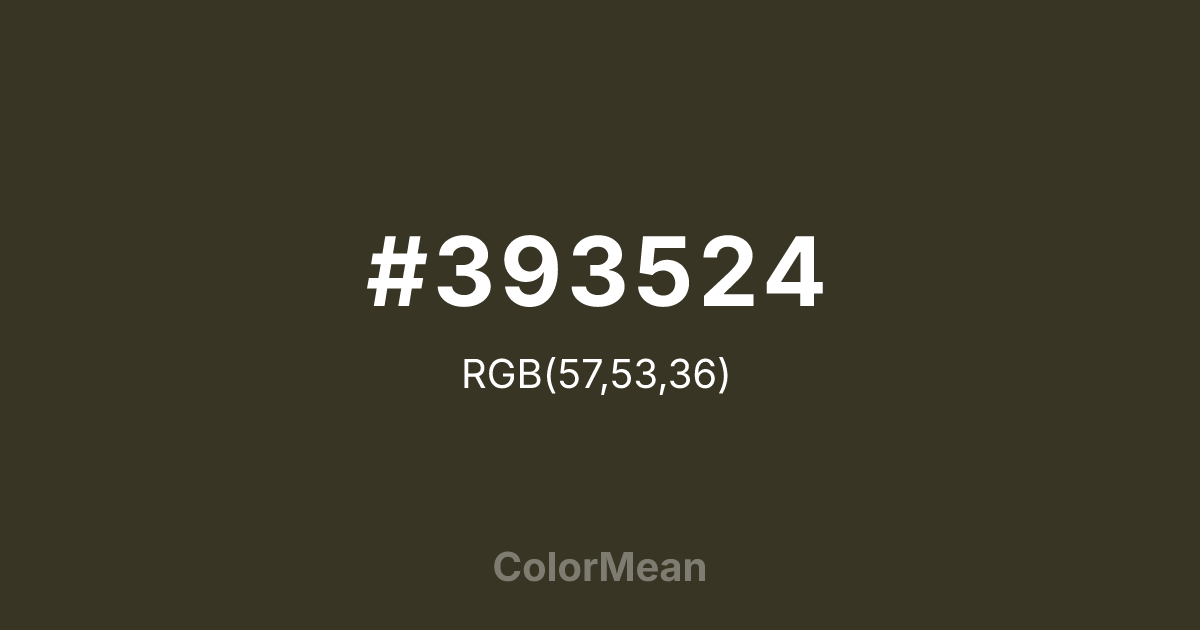
#393524 Color Information
#393524 RGB value is (57, 53, 36). The hex color red value is 57, green is 53, and blue is 36. Its HSL format shows a hue of 49°, saturation of 23 percent, and lightness of 18 percent. The CMYK process values are 0 percent, 7 percent, 37 percent, 78 percent.
#393524 Color Meaning
Color #393524 embodies the hush of dense forest floors and weathered canvas. #393524 near-umber green-brown absorbs light rather than reflects #393524, suggesting endurance through obscurity. Color #393524 doesn’t seek attention—#393524 survives #393524. Designers use color #393524 in tactical branding, heritage workwear, and archival typography where function eclipses form. Unlike brighter olives that flirt with vibrancy, color #393524 leans into its brown base, evoking mud-streaked gear and sun-bleached maps. Its low luminance reduces visual noise in complex interfaces, making #393524 ideal for background elements in data-dense environments. Color #393524 supports without distracting—like a well-worn strap or a trusted field notebook. Culturally, #393524 ties to mid-century military logistics and analog exploration. Modern reinterpretations use color #393524 to signal rugged authenticity in outdoor tech and sustainable fashion. Paired with bone white or oxidized copper, color #393524 creates palettes that feel excavated, not designed—rooted in use, not trend.
Color Conversion
Convert #393524 across different color models and formats. These conversions help designers work seamlessly between digital and print media, ensuring this color maintains its intended appearance across RGB screens, CMYK printers, and HSL color manipulations.
RGB Values & CMYK Values
RGB Values
CMYK Values
Color Variations
#393524 harmonies come to life through carefully balanced shades, tints, and tones, giving this color depth and flexibility across light and dark variations. Shades add richness, tints bring an airy softness, and tones soften intensity, making it easy to pair in clean, modern palettes.
Color Harmonies
#393524 harmonies create beautiful relationships with other colors based on their position on the color wheel. Each harmony type offers unique design possibilities, enabling cohesive and visually appealing color schemes.
Analogous
Colors adjacent on the color wheel (30° apart)
Complementary
Colors opposite on the color wheel (180° apart)
Split Complementary
Three colors using one base hue and the two hues beside its opposite
Triadic
Three colors evenly spaced (120° apart)
Tetradic
Four colors forming a rectangle on the wheel
Square
Four colors evenly spaced (90° apart)
Double Split
Four colors formed from two base hues and the colors next to their opposites
Monochromatic
Variations of a single hue
Contrast Checker
(WCAG 2.1) Test #393524 for accessibility compliance against white and black backgrounds. Proper contrast ensures this color remains readable and usable for all audiences, meeting WCAG 2.1 standards for both normal and large text applications.
Sample Text
This is how your text will look with these colors.
Large Text (18pt+)
Normal Text
UI Components
Color Blindness Simulator
See how #393524 appears to people with different types of color vision deficiencies. These simulations help create more inclusive designs that consider how this color is perceived across various visual abilities.
Normal Vision
protanopia
Note: These simulations are approximations. Actual color vision deficiency varies by individual.
CSS Examples
Background Color
Text Color
Sample Text
Border Color
Box Shadow
Text Shadow
Sample Text
Gradient
#393524 Color FAQs
Frequently asked questions about #393524 color meaning, symbolism, and applications. Click on any question to expand detailed answers.

