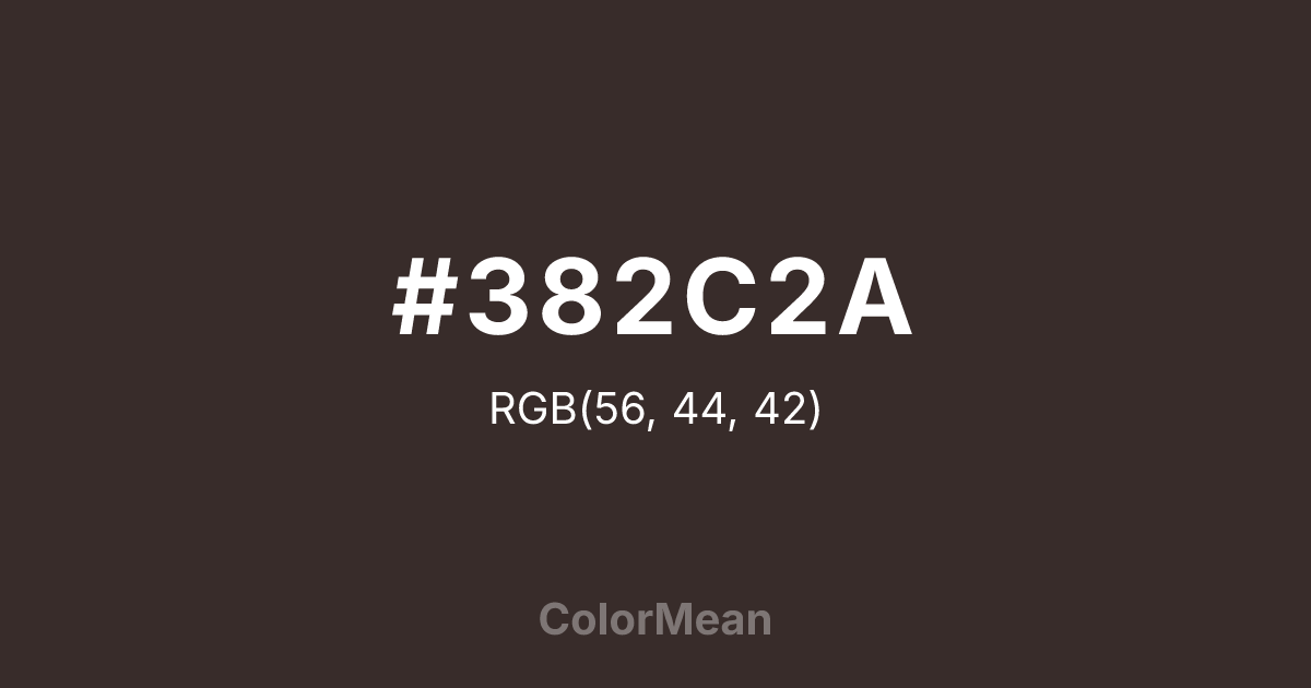
#382C2A Color Information
#382C2A RGB value is (56, 44, 42). The hex color red value is 56, green is 44, and blue is 42. Its HSL format shows a hue of 9°, saturation of 14 percent, and lightness of 19 percent. The CMYK process values are 0 percent, 21 percent, 25 percent, 78 percent.
#382C2A Color Meaning
Color #382C2A embodies subtlety, neutrality, and understated sophistication. #382C2A dark, muted grey carries hints of brown, producing a calming, reflective presence. Psychologically, color #382C2A stabilizes emotions, reduces overstimulation, and provides a visual anchor for focus and contemplation. Culturally, dark grey shades like #382C2A are linked to professionalism, maturity, and elegance in Western societies. Eastern perspectives interpret #382C2A as balanced, disciplined, and grounding. Feng Shui uses grey for career and knowledge areas to support thoughtful planning, concentration, and structural stability. Spiritually, color #382C2A connects with grounding energies and encourages measured, deliberate action. In design, color #382C2A functions as a sophisticated backdrop or secondary accent, complementing brighter tones without competing. Artists use #382C2A for depth, shadow, and subtle contrast in compositions. Its muted, dark quality conveys quiet authority and stability.
Color Conversion
Convert #382C2A across different color models and formats. These conversions help designers work seamlessly between digital and print media, ensuring this color maintains its intended appearance across RGB screens, CMYK printers, and HSL color manipulations.
RGB Values & CMYK Values
RGB Values
CMYK Values
Color Variations
#382C2A harmonies come to life through carefully balanced shades, tints, and tones, giving this color depth and flexibility across light and dark variations. Shades add richness, tints bring an airy softness, and tones soften intensity, making it easy to pair in clean, modern palettes.
Color Harmonies
#382C2A harmonies create beautiful relationships with other colors based on their position on the color wheel. Each harmony type offers unique design possibilities, enabling cohesive and visually appealing color schemes.
Analogous
Colors adjacent on the color wheel (30° apart)
Complementary
Colors opposite on the color wheel (180° apart)
Split Complementary
Three colors using one base hue and the two hues beside its opposite
Triadic
Three colors evenly spaced (120° apart)
Tetradic
Four colors forming a rectangle on the wheel
Square
Four colors evenly spaced (90° apart)
Double Split
Four colors formed from two base hues and the colors next to their opposites
Monochromatic
Variations of a single hue
Contrast Checker
(WCAG 2.1) Test #382C2A for accessibility compliance against white and black backgrounds. Proper contrast ensures this color remains readable and usable for all audiences, meeting WCAG 2.1 standards for both normal and large text applications.
Sample Text
This is how your text will look with these colors.
Large Text (18pt+)
Normal Text
UI Components
Color Blindness Simulator
See how #382C2A appears to people with different types of color vision deficiencies. These simulations help create more inclusive designs that consider how this color is perceived across various visual abilities.
Normal Vision
protanopia
Note: These simulations are approximations. Actual color vision deficiency varies by individual.
CSS Examples
Background Color
Text Color
Sample Text
Border Color
Box Shadow
Text Shadow
Sample Text
Gradient
#382C2A Color FAQs
Frequently asked questions about #382C2A color meaning, symbolism, and applications. Click on any question to expand detailed answers.

