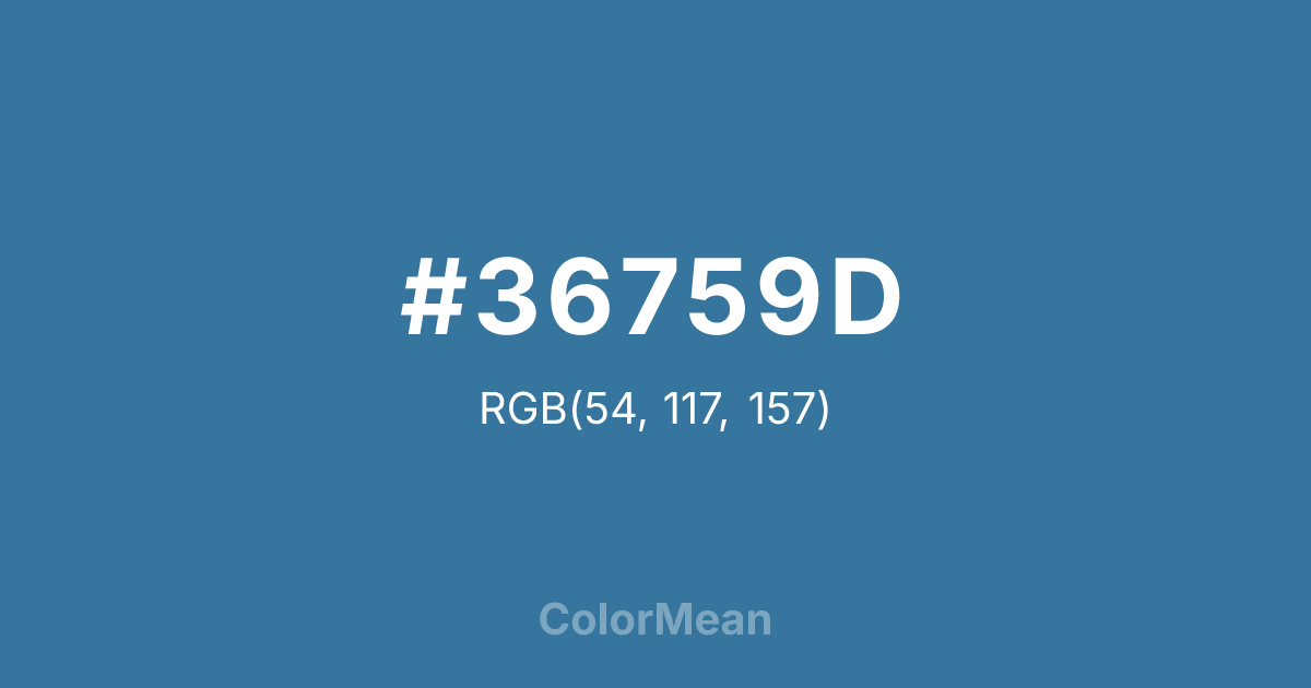
#36759D Color Information
#36759D RGB value is (54, 117, 157). The hex color red value is 54, green is 117, and blue is 157. Its HSL format shows a hue of 203°, saturation of 49 percent, and lightness of 41 percent. The CMYK process values are 66 percent, 25 percent, 0 percent, 38 percent.
#36759D Color Meaning
Color #36759D denotes regal serenity, dignified authority, and expansive calm. #36759D medium, slightly greyish azure evokes a clear midday sky over a cold sea, suggesting sovereignty that is wise, protective, and commandingly tranquil. Psychologically, color #36759D is cooling and confidently stabilizing, promoting clear judgment, loyal leadership, and a sense of benevolent, structured order. #36759D combines the trust of blue with a subtle, majestic gravity, making #36759D feel both approachable and respectfully distant. #36759D color is rulership viewed through a lens of calm intelligence. Culturally, color #36759D is linked to heraldry, naval command, and institutional branding where trust, stability, and traditional authority are paramount. Symbolically, #36759D represents the rule of law, the vast and orderly domain, and a protector's watchful, calm gaze. Therefore, color #36759D acts as a visual standard for a certain kind of reliable, noble power, one that governs with a steady hand and a cool, composed mind.
Color Conversion
Convert #36759D across different color models and formats. These conversions help designers work seamlessly between digital and print media, ensuring this color maintains its intended appearance across RGB screens, CMYK printers, and HSL color manipulations.
RGB Values & CMYK Values
RGB Values
CMYK Values
Color Variations
#36759D harmonies come to life through carefully balanced shades, tints, and tones, giving this color depth and flexibility across light and dark variations. Shades add richness, tints bring an airy softness, and tones soften intensity, making it easy to pair in clean, modern palettes.
Color Harmonies
#36759D harmonies create beautiful relationships with other colors based on their position on the color wheel. Each harmony type offers unique design possibilities, enabling cohesive and visually appealing color schemes.
Analogous
Colors adjacent on the color wheel (30° apart)
Complementary
Colors opposite on the color wheel (180° apart)
Split Complementary
Three colors using one base hue and the two hues beside its opposite
Triadic
Three colors evenly spaced (120° apart)
Tetradic
Four colors forming a rectangle on the wheel
Square
Four colors evenly spaced (90° apart)
Double Split
Four colors formed from two base hues and the colors next to their opposites
Monochromatic
Variations of a single hue
Contrast Checker
(WCAG 2.1) Test #36759D for accessibility compliance against white and black backgrounds. Proper contrast ensures this color remains readable and usable for all audiences, meeting WCAG 2.1 standards for both normal and large text applications.
Sample Text
This is how your text will look with these colors.
Large Text (18pt+)
Normal Text
UI Components
Color Blindness Simulator
See how #36759D appears to people with different types of color vision deficiencies. These simulations help create more inclusive designs that consider how this color is perceived across various visual abilities.
Normal Vision
protanopia
Note: These simulations are approximations. Actual color vision deficiency varies by individual.
CSS Examples
Background Color
Text Color
Sample Text
Border Color
Box Shadow
Text Shadow
Sample Text
Gradient
#36759D Color FAQs
Frequently asked questions about #36759D color meaning, symbolism, and applications. Click on any question to expand detailed answers.
