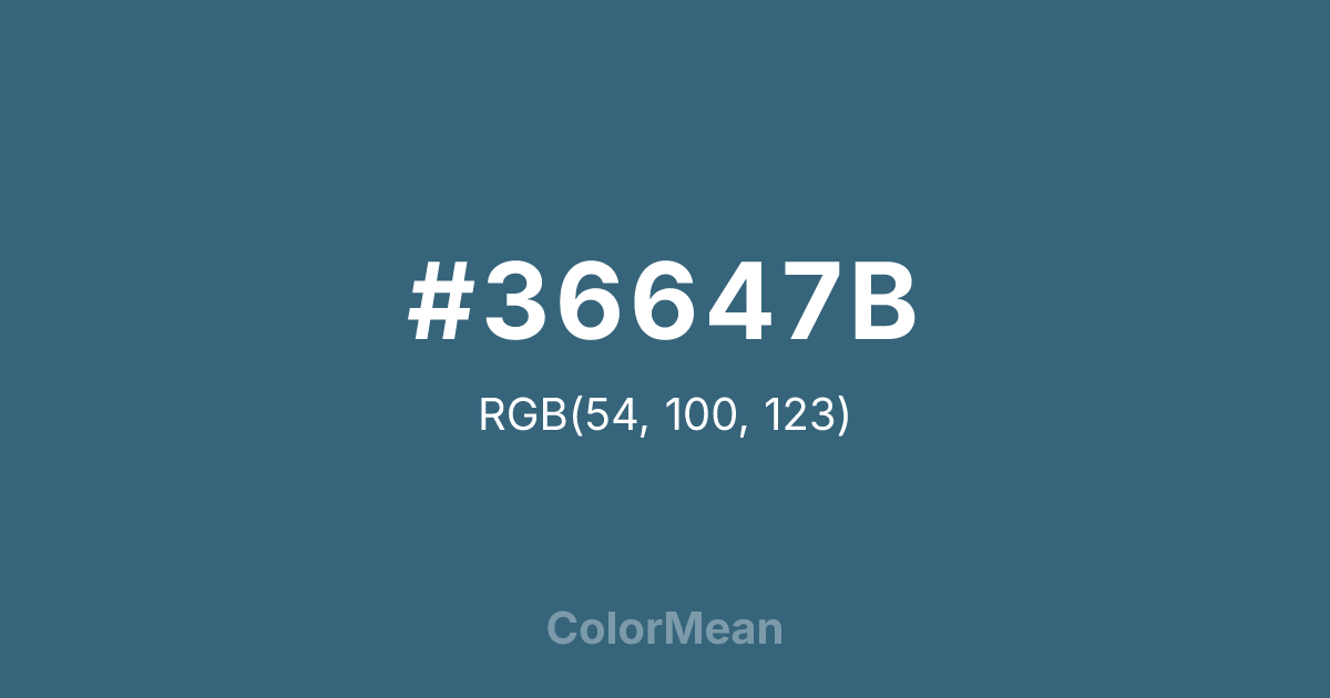
#36647B Color Information
#36647B RGB value is (54, 100, 123). The hex color red value is 54, green is 100, and blue is 123. Its HSL format shows a hue of 200°, saturation of 39 percent, and lightness of 35 percent. The CMYK process values are 56 percent, 19 percent, 0 percent, 52 percent.
#36647B Color Meaning
Color #36647B conveys deep aquatic knowledge, stormy introspection, and medicinal clarity. #36647B dark, greenish-blue is named for the gentian flower, historically used in remedies, and evokes deep ocean trenches, stormy skies, and antique glass bottles. Psychologically, color #36647B is cool, profound, and mentally clarifying, encouraging deep thought, emotional truth-seeking, and a sense of purifying depth. #36647B soothes feverishness with its chilling, penetrating serenity. #36647B color feels both ancient and intellectually potent. Culturally, color #36647B references apothecary history, maritime exploration, and certain schools of abstract painting. Symbolically, #36647B represents hidden knowledge, emotional depth, and healing that comes from confronting profound truths. Spiritually, #36647B aligns with the throat and third eye chakras, facilitating the expression of deep insight and intuitive understanding. Color #36647B is a color for contemplation, depth, and quiet, powerful transformation.
Color Conversion
Convert #36647B across different color models and formats. These conversions help designers work seamlessly between digital and print media, ensuring this color maintains its intended appearance across RGB screens, CMYK printers, and HSL color manipulations.
RGB Values & CMYK Values
RGB Values
CMYK Values
Color Variations
#36647B harmonies come to life through carefully balanced shades, tints, and tones, giving this color depth and flexibility across light and dark variations. Shades add richness, tints bring an airy softness, and tones soften intensity, making it easy to pair in clean, modern palettes.
Color Harmonies
#36647B harmonies create beautiful relationships with other colors based on their position on the color wheel. Each harmony type offers unique design possibilities, enabling cohesive and visually appealing color schemes.
Analogous
Colors adjacent on the color wheel (30° apart)
Complementary
Colors opposite on the color wheel (180° apart)
Split Complementary
Three colors using one base hue and the two hues beside its opposite
Triadic
Three colors evenly spaced (120° apart)
Tetradic
Four colors forming a rectangle on the wheel
Square
Four colors evenly spaced (90° apart)
Double Split
Four colors formed from two base hues and the colors next to their opposites
Monochromatic
Variations of a single hue
Contrast Checker
(WCAG 2.1) Test #36647B for accessibility compliance against white and black backgrounds. Proper contrast ensures this color remains readable and usable for all audiences, meeting WCAG 2.1 standards for both normal and large text applications.
Sample Text
This is how your text will look with these colors.
Large Text (18pt+)
Normal Text
UI Components
Color Blindness Simulator
See how #36647B appears to people with different types of color vision deficiencies. These simulations help create more inclusive designs that consider how this color is perceived across various visual abilities.
Normal Vision
protanopia
Note: These simulations are approximations. Actual color vision deficiency varies by individual.
CSS Examples
Background Color
Text Color
Sample Text
Border Color
Box Shadow
Text Shadow
Sample Text
Gradient
#36647B Color FAQs
Frequently asked questions about #36647B color meaning, symbolism, and applications. Click on any question to expand detailed answers.
