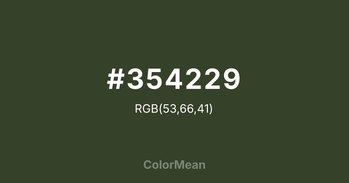
#354229 Color Information
#354229 RGB value is (53, 66, 41). The hex color red value is 53, green is 66, and blue is 41. Its HSL format shows a hue of 91°, saturation of 23 percent, and lightness of 21 percent. The CMYK process values are 20 percent, 0 percent, 38 percent, 74 percent.
#354229 Color Meaning
Color #354229 communicates oceanic depth, mineral quiet, and regenerative stillness. Inspired by dried kelp (kombu), #354229 near-black green (RGB 53, 66, 40) feels submerged—cool, dense, and nutrient-rich. Color #354229 offers a more organic alternative to charcoal, with subtle warmth that prevents sterility. #354229’s favored in sustainable seafood, biotech, and eco-luxury packaging for its ecological authenticity. In environmental psychology, deep greens like color #354229 trigger associations with underwater calm and forest floor decomposition—processes hidden but vital. Unlike bright greens that signal growth, #354229 hue signifies renewal through decay. Culturally, #354229 links to Japanese moku (wood element) philosophy: strength through flexibility and patience. Designers pair #354229 with cream or seafoam to create high-contrast yet harmonious schemes. Symbolically, color #354229 stands for invisible systems: the roots, the currents, the cycles that sustain without seeking notice.
Color Conversion
Convert #354229 across different color models and formats. These conversions help designers work seamlessly between digital and print media, ensuring this color maintains its intended appearance across RGB screens, CMYK printers, and HSL color manipulations.
RGB Values & CMYK Values
RGB Values
CMYK Values
Color Variations
#354229 harmonies come to life through carefully balanced shades, tints, and tones, giving this color depth and flexibility across light and dark variations. Shades add richness, tints bring an airy softness, and tones soften intensity, making it easy to pair in clean, modern palettes.
Color Harmonies
#354229 harmonies create beautiful relationships with other colors based on their position on the color wheel. Each harmony type offers unique design possibilities, enabling cohesive and visually appealing color schemes.
Analogous
Colors adjacent on the color wheel (30° apart)
Complementary
Colors opposite on the color wheel (180° apart)
Split Complementary
Three colors using one base hue and the two hues beside its opposite
Triadic
Three colors evenly spaced (120° apart)
Tetradic
Four colors forming a rectangle on the wheel
Square
Four colors evenly spaced (90° apart)
Double Split
Four colors formed from two base hues and the colors next to their opposites
Monochromatic
Variations of a single hue
Contrast Checker
(WCAG 2.1) Test #354229 for accessibility compliance against white and black backgrounds. Proper contrast ensures this color remains readable and usable for all audiences, meeting WCAG 2.1 standards for both normal and large text applications.
Sample Text
This is how your text will look with these colors.
Large Text (18pt+)
Normal Text
UI Components
Color Blindness Simulator
See how #354229 appears to people with different types of color vision deficiencies. These simulations help create more inclusive designs that consider how this color is perceived across various visual abilities.
Normal Vision
protanopia
Note: These simulations are approximations. Actual color vision deficiency varies by individual.
CSS Examples
Background Color
Text Color
Sample Text
Border Color
Box Shadow
Text Shadow
Sample Text
Gradient
#354229 Color FAQs
Frequently asked questions about #354229 color meaning, symbolism, and applications. Click on any question to expand detailed answers.

