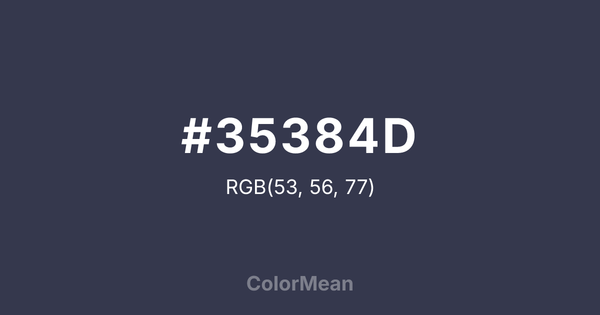
#35384D Color Information
#35384D RGB value is (53, 56, 77). The hex color red value is 53, green is 56, and blue is 77. Its HSL format shows a hue of 233°, saturation of 18 percent, and lightness of 25 percent. The CMYK process values are 31 percent, 27 percent, 0 percent, 70 percent.
#35384D Color Meaning
Color #35384D signifies urban depth, intellectual gravity, and restrained authority. Color #35384D is a deep, slightly blue-grey that sits between black and navy—dense enough to feel serious, cool enough to avoid heaviness. Unlike pure black, #35384D retains chromatic identity; unlike slate, #35384D carries weight. In corporate and editorial design, color #35384D signals professionalism without sterility. Usability research confirms #35384D reduces eye strain better than black in long-form digital reading while maintaining strong contrast. Functionally, color #35384D is a versatile alternative to black in typography, UI elements, and print. #35384D meets WCAG AAA standards for text against white and pairs beautifully with warm accents like rust, ochre, or sage. Print reproduction is consistent across all stocks, and its subtle blue undertone prevents the “muddy” effect of pure greys. Consumer perception studies show brands using color #35384D are rated as more thoughtful and modern than those using black. Symbolically, color #35384D represents authority that listens. #35384D is the color of midnight cityscapes, pressed wool, and well-worn notebooks. In spiritual practice, #35384D aligns with the third eye’s discerning mode: judgment tempered by observation. Designers choose color #35384D when they want to signal depth without darkness. Its power lies in its precision—not absence, but intention.
Color Conversion
Convert #35384D across different color models and formats. These conversions help designers work seamlessly between digital and print media, ensuring this color maintains its intended appearance across RGB screens, CMYK printers, and HSL color manipulations.
RGB Values & CMYK Values
RGB Values
CMYK Values
Color Variations
#35384D harmonies come to life through carefully balanced shades, tints, and tones, giving this color depth and flexibility across light and dark variations. Shades add richness, tints bring an airy softness, and tones soften intensity, making it easy to pair in clean, modern palettes.
Color Harmonies
#35384D harmonies create beautiful relationships with other colors based on their position on the color wheel. Each harmony type offers unique design possibilities, enabling cohesive and visually appealing color schemes.
Analogous
Colors adjacent on the color wheel (30° apart)
Complementary
Colors opposite on the color wheel (180° apart)
Split Complementary
Three colors using one base hue and the two hues beside its opposite
Triadic
Three colors evenly spaced (120° apart)
Tetradic
Four colors forming a rectangle on the wheel
Square
Four colors evenly spaced (90° apart)
Double Split
Four colors formed from two base hues and the colors next to their opposites
Monochromatic
Variations of a single hue
Contrast Checker
(WCAG 2.1) Test #35384D for accessibility compliance against white and black backgrounds. Proper contrast ensures this color remains readable and usable for all audiences, meeting WCAG 2.1 standards for both normal and large text applications.
Sample Text
This is how your text will look with these colors.
Large Text (18pt+)
Normal Text
UI Components
Color Blindness Simulator
See how #35384D appears to people with different types of color vision deficiencies. These simulations help create more inclusive designs that consider how this color is perceived across various visual abilities.
Normal Vision
protanopia
Note: These simulations are approximations. Actual color vision deficiency varies by individual.
CSS Examples
Background Color
Text Color
Sample Text
Border Color
Box Shadow
Text Shadow
Sample Text
Gradient
#35384D Color FAQs
Frequently asked questions about #35384D color meaning, symbolism, and applications. Click on any question to expand detailed answers.
