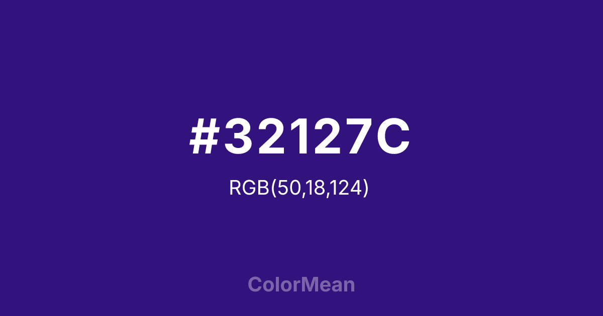
#32127C Color Information
#32127C RGB value is (50, 18, 124). The hex color red value is 50, green is 18, and blue is 124. Its HSL format shows a hue of 258°, saturation of 75 percent, and lightness of 28 percent. The CMYK process values are 60 percent, 85 percent, 0 percent, 51 percent.
#32127C Color Meaning
Color #32127C conveys profound mystery, spiritual depth, and luxurious knowledge. #32127C very dark, violet-blue is dense and absorbing, historically derived from rare dyes, suggesting the night sky, deep meditation, and esoteric wisdom. Psychologically, color #32127C is introspective and awe-inspiring, promoting deep contemplation, intuitive insight, and a sense of encountering vast, silent truths. #32127C soothes the nervous system with its immense depth while simultaneously stimulating the higher mind. #32127C color is the visual equivalent of a profound silence filled with potential. Culturally, color #32127C is linked to ancient textile traditions, religious manuscripts, and the robes of royalty and priests, symbolizing sacred knowledge, supreme authority, and the threshold of the unknowable. Symbolically, #32127C represents the void from which creation springs, the inner eye that sees beyond sight, and wisdom that is earned through disciplined seeking. Color #32127C embodies the ultimate marriage of intellect and spirit, colored in the deepest hue of the night.
Color Conversion
Convert #32127C across different color models and formats. These conversions help designers work seamlessly between digital and print media, ensuring this color maintains its intended appearance across RGB screens, CMYK printers, and HSL color manipulations.
RGB Values & CMYK Values
RGB Values
CMYK Values
Color Variations
#32127C harmonies come to life through carefully balanced shades, tints, and tones, giving this color depth and flexibility across light and dark variations. Shades add richness, tints bring an airy softness, and tones soften intensity, making it easy to pair in clean, modern palettes.
Color Harmonies
#32127C harmonies create beautiful relationships with other colors based on their position on the color wheel. Each harmony type offers unique design possibilities, enabling cohesive and visually appealing color schemes.
Analogous
Colors adjacent on the color wheel (30° apart)
Complementary
Colors opposite on the color wheel (180° apart)
Split Complementary
Three colors using one base hue and the two hues beside its opposite
Triadic
Three colors evenly spaced (120° apart)
Tetradic
Four colors forming a rectangle on the wheel
Square
Four colors evenly spaced (90° apart)
Double Split
Four colors formed from two base hues and the colors next to their opposites
Monochromatic
Variations of a single hue
Contrast Checker
(WCAG 2.1) Test #32127C for accessibility compliance against white and black backgrounds. Proper contrast ensures this color remains readable and usable for all audiences, meeting WCAG 2.1 standards for both normal and large text applications.
Sample Text
This is how your text will look with these colors.
Large Text (18pt+)
Normal Text
UI Components
Color Blindness Simulator
See how #32127C appears to people with different types of color vision deficiencies. These simulations help create more inclusive designs that consider how this color is perceived across various visual abilities.
Normal Vision
protanopia
Note: These simulations are approximations. Actual color vision deficiency varies by individual.
CSS Examples
Background Color
Text Color
Sample Text
Border Color
Box Shadow
Text Shadow
Sample Text
Gradient
#32127C Color FAQs
Frequently asked questions about #32127C color meaning, symbolism, and applications. Click on any question to expand detailed answers.

