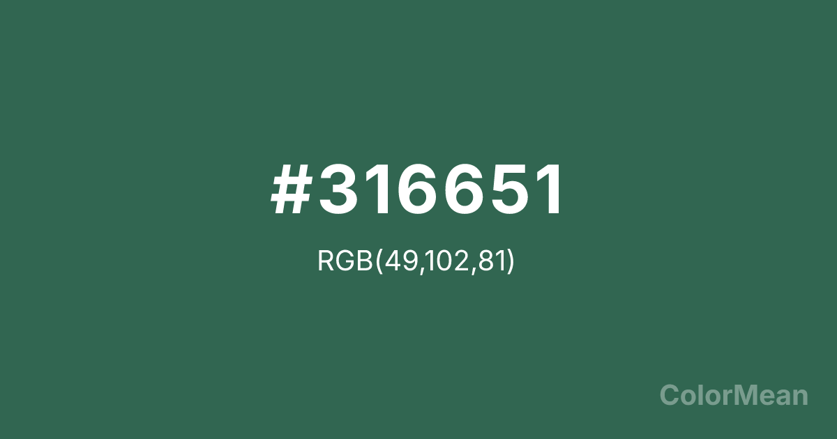
#316651 Color Information
#316651 RGB value is (49, 102, 81). The hex color red value is 49, green is 102, and blue is 81. Its HSL format shows a hue of 156°, saturation of 35 percent, and lightness of 30 percent. The CMYK process values are 52 percent, 0 percent, 21 percent, 60 percent.
#316651 Color Meaning
Color #316651 signifies aged elegance, natural transformation, and historical endurance. #316651 deep, greyish-green is the color of oxidized copper, suggesting objects that have been transformed and enriched by time and the elements. Psychologically, color #316651 is deeply stabilizing and contemplative, evoking a sense of legacy, quiet resilience, and organic history. #316651 encourages respect for processes that are slow, natural, and ultimately beautiful in their imperfection. #316651 color feels both ancient and alive, carrying a narrative of change. Culturally, color #316651 is associated with antique architecture, archaeological artifacts, and classic bronze sculptures, representing heritage, authenticity, and the beauty of decay. Symbolically, #316651 stands for wisdom earned through experience, the graceful acceptance of change, and value that increases with age. Spiritually, color #316651 connects to the heart of the earth, representing growth that encompasses both life and respectful decomposition, embodying the full, patient cycle of nature.
Convert #316651 across different color models and formats. These conversions help designers work seamlessly between digital and print media, ensuring this color maintains its intended appearance across RGB screens, CMYK printers, and HSL color manipulations.
RGB Values
CMYK Values
#316651 harmonies come to life through carefully balanced shades, tints, and tones, giving this color depth and flexibility across light and dark variations. Shades add richness, tints bring an airy softness, and tones soften intensity, making it easy to pair in clean, modern palettes.
#316651 harmonies create beautiful relationships with other colors based on their position on the color wheel. Each harmony type offers unique design possibilities, enabling cohesive and visually appealing color schemes.
Analogous
Colors adjacent on the color wheel (30° apart)
Complementary
Colors opposite on the color wheel (180° apart)
Split Complementary
Three colors using one base hue and the two hues beside its opposite
Triadic
Three colors evenly spaced (120° apart)
Tetradic
Four colors forming a rectangle on the wheel
Square
Four colors evenly spaced (90° apart)
Double Split
Four colors formed from two base hues and the colors next to their opposites
Monochromatic
Variations of a single hue
(WCAG 2.1) Test #316651 for accessibility compliance against white and black backgrounds. Proper contrast ensures this color remains readable and usable for all audiences, meeting WCAG 2.1 standards for both normal and large text applications.
Sample Text
This is how your text will look with these colors.
Large Text (18pt+)
Normal Text
UI Components
See how #316651 appears to people with different types of color vision deficiencies. These simulations help create more inclusive designs that consider how this color is perceived across various visual abilities.
Normal Vision
protanopia
Note: These simulations are approximations. Actual color vision deficiency varies by individual.
Background Color
Text Color
Sample Text
Border Color
Box Shadow
Text Shadow
Sample Text
Gradient
#316651 Color FAQs
Frequently asked questions about #316651 color meaning, symbolism, and applications. Click on any question to expand detailed answers.
