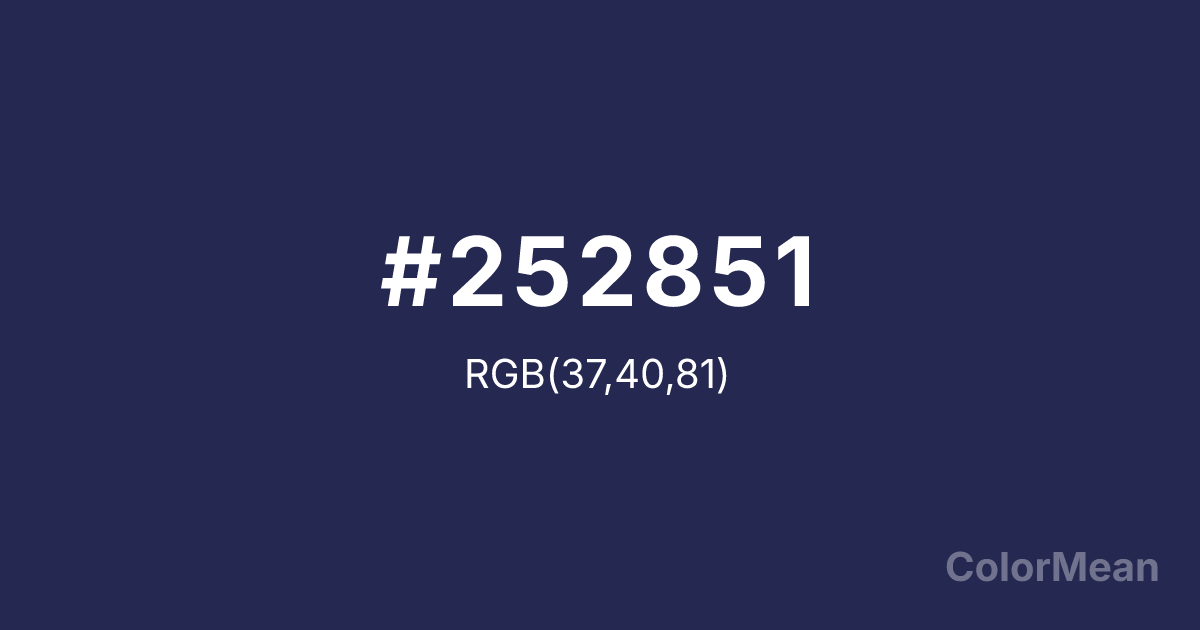
#252851 Color Information
#252851 RGB value is (37, 40, 81). The hex color red value is 37, green is 40, and blue is 81. Its HSL format shows a hue of 236°, saturation of 37 percent, and lightness of 23 percent. The CMYK process values are 54 percent, 51 percent, 0 percent, 68 percent.
#252851 Color Meaning
Color #252851 descends into contemplative depth, cosmic stillness, and intellectual shadow. Color #252851 is not black, nor is #252851 standard navy—#252851’s a near-black violet-blue that absorbs light like deep water. #252851 evokes midnight observatories, encrypted data streams, and the quiet intensity of focused thought. Psychologically, color #252851 promotes deep concentration by minimizing peripheral distraction. In low-light interfaces (e.g., dark mode apps), #252851 reduces glare while preserving chromatic identity—unlike pure black, which flattens depth. #252851’s favored in coding environments, research dashboards, and meditation apps for its non-intrusive authority. Astronomically, color #252851 mirrors the actual color of night sky away from light pollution—a rich, star-dusted indigo. #252851 scientific grounding gives #252851 credibility in space tech, astrophysics outreach, and speculative design. #252851 doesn’t romanticize the cosmos; #252851 observes #252851 with precision. Symbolically, color #252851 represents disciplined mystery. #252851 is the color of questions held in silence, of data waiting to be interpreted. In luxury or tech branding, #252851 conveys exclusivity without arrogance—reserved for those who look deeper. #252851’s not the absence of light; #252851’s the presence of depth.
Convert #252851 across different color models and formats. These conversions help designers work seamlessly between digital and print media, ensuring this color maintains its intended appearance across RGB screens, CMYK printers, and HSL color manipulations.
RGB Values
CMYK Values
#252851 harmonies come to life through carefully balanced shades, tints, and tones, giving this color depth and flexibility across light and dark variations. Shades add richness, tints bring an airy softness, and tones soften intensity, making it easy to pair in clean, modern palettes.
#252851 harmonies create beautiful relationships with other colors based on their position on the color wheel. Each harmony type offers unique design possibilities, enabling cohesive and visually appealing color schemes.
Analogous
Colors adjacent on the color wheel (30° apart)
Complementary
Colors opposite on the color wheel (180° apart)
Split Complementary
Three colors using one base hue and the two hues beside its opposite
Triadic
Three colors evenly spaced (120° apart)
Tetradic
Four colors forming a rectangle on the wheel
Square
Four colors evenly spaced (90° apart)
Double Split
Four colors formed from two base hues and the colors next to their opposites
Monochromatic
Variations of a single hue
(WCAG 2.1) Test #252851 for accessibility compliance against white and black backgrounds. Proper contrast ensures this color remains readable and usable for all audiences, meeting WCAG 2.1 standards for both normal and large text applications.
Sample Text
This is how your text will look with these colors.
Large Text (18pt+)
Normal Text
UI Components
See how #252851 appears to people with different types of color vision deficiencies. These simulations help create more inclusive designs that consider how this color is perceived across various visual abilities.
Normal Vision
protanopia
Note: These simulations are approximations. Actual color vision deficiency varies by individual.
Background Color
Text Color
Sample Text
Border Color
Box Shadow
Text Shadow
Sample Text
Gradient
#252851 Color FAQs
Frequently asked questions about #252851 color meaning, symbolism, and applications. Click on any question to expand detailed answers.
