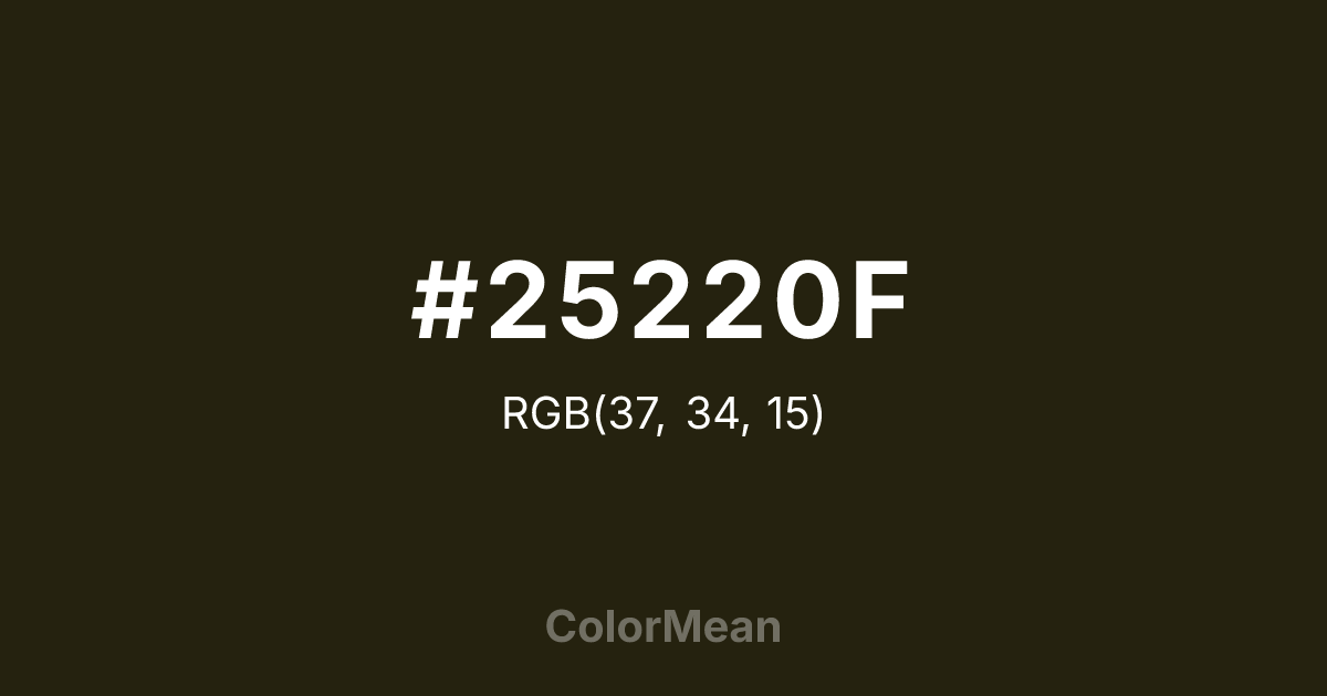
#25220F Color Information
#25220F RGB value is (37, 34, 15). The hex color red value is 37, green is 34, and blue is 15. Its HSL format shows a hue of 52°, saturation of 42 percent, and lightness of 10 percent. The CMYK process values are 0 percent, 8 percent, 59 percent, 85 percent.
#25220F Color Meaning
Color #25220F disappears into the shadows with purpose. #25220F near-black brown-green—darker than charcoal in some lights—was engineered for total concealment in low-canopy forests and nighttime operations. Color #25220F doesn’t merely blend; #25220F erases. #25220F is the color of unseen readiness, silent observation, and tactical patience. In visual design, color #25220F functions as a warm alternative to true black, reducing screen harshness while maintaining depth. Unlike cool blacks that feel digital or sterile, color #25220F carries organic memory—like soil-packed canvas or oil-stained leather. Designers use color #25220F in night-mode interfaces, survival gear branding, and minimalist fashion where presence must be felt, not seen. Historically rooted in WWII-era field uniforms, color #25220F now signals anti-consumerist durability in outdoor and military-inspired apparel. Paired with bone white or rust accents, #25220F creates palettes that feel excavated, not designed. Color #25220F rejects spectacle entirely—#25220F is the color of preparedness without announcement, existing not to be admired, but to endure.
Color Conversion
Convert #25220F across different color models and formats. These conversions help designers work seamlessly between digital and print media, ensuring this color maintains its intended appearance across RGB screens, CMYK printers, and HSL color manipulations.
RGB Values & CMYK Values
RGB Values
CMYK Values
Color Variations
#25220F harmonies come to life through carefully balanced shades, tints, and tones, giving this color depth and flexibility across light and dark variations. Shades add richness, tints bring an airy softness, and tones soften intensity, making it easy to pair in clean, modern palettes.
Color Harmonies
#25220F harmonies create beautiful relationships with other colors based on their position on the color wheel. Each harmony type offers unique design possibilities, enabling cohesive and visually appealing color schemes.
Analogous
Colors adjacent on the color wheel (30° apart)
Complementary
Colors opposite on the color wheel (180° apart)
Split Complementary
Three colors using one base hue and the two hues beside its opposite
Triadic
Three colors evenly spaced (120° apart)
Tetradic
Four colors forming a rectangle on the wheel
Square
Four colors evenly spaced (90° apart)
Double Split
Four colors formed from two base hues and the colors next to their opposites
Monochromatic
Variations of a single hue
Contrast Checker
(WCAG 2.1) Test #25220F for accessibility compliance against white and black backgrounds. Proper contrast ensures this color remains readable and usable for all audiences, meeting WCAG 2.1 standards for both normal and large text applications.
Sample Text
This is how your text will look with these colors.
Large Text (18pt+)
Normal Text
UI Components
Color Blindness Simulator
See how #25220F appears to people with different types of color vision deficiencies. These simulations help create more inclusive designs that consider how this color is perceived across various visual abilities.
Normal Vision
protanopia
Note: These simulations are approximations. Actual color vision deficiency varies by individual.
CSS Examples
Background Color
Text Color
Sample Text
Border Color
Box Shadow
Text Shadow
Sample Text
Gradient
#25220F Color FAQs
Frequently asked questions about #25220F color meaning, symbolism, and applications. Click on any question to expand detailed answers.
