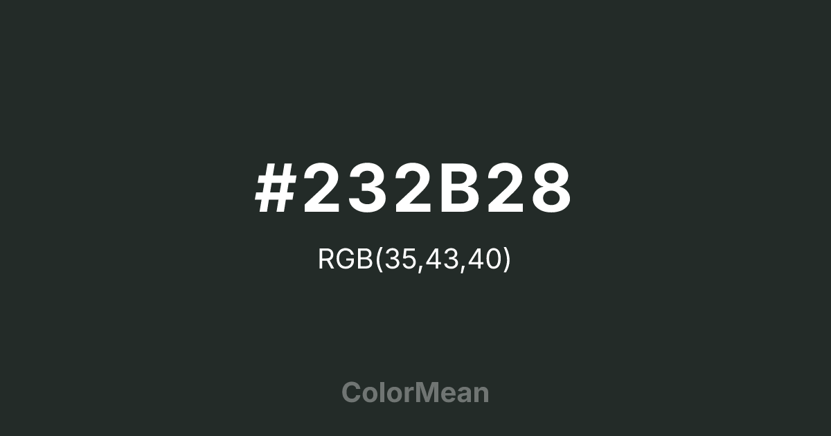
#232B28 Color Information
#232B28 RGB value is (35, 43, 40). The hex color red value is 35, green is 43, and blue is 40. Its HSL format shows a hue of 157°, saturation of 10 percent, and lightness of 15 percent. The CMYK process values are 19 percent, 0 percent, 7 percent, 83 percent.
#232B28 Color Meaning
Color #232B28 conveys historic resolve, coastal dignity, and chromatic containment. Color #232B28 is an almost-black green historically used on doors and shutters in Charleston, South Carolina, after the Civil War—a tone of quiet defiance disguised as decorum. In low light, #232B28 reads as black; in daylight, its green undertone emerges, revealing resilience beneath restraint. In architectural psychology, such “hidden chroma” colors increase perceived sophistication and historical continuity in urban spaces. In design, color #232B28 functions as a luxurious alternative to black. #232B28 adds depth to typography, packaging, and digital interfaces without the visual harshness of true black. On OLED screens, #232B28 reduces blue-light emission while preserving contrast. Print applications benefit from its richness on matte finishes, especially in heritage branding and luxury goods. Consumer studies show higher perceived craftsmanship for products using color #232B28 versus standard black. Culturally, color #232B28 reflects strength that hides in plain sight. #232B28 appears in historical preservation, literary publishing, and slow design as a symbol of dignity through discretion. Spiritually, #232B28 aligns with the root chakra’s protective mode: security through subtlety. Designers use color #232B28 when they want authority that reveals itself slowly. Its power is in its patience.
Color Conversion
Convert #232B28 across different color models and formats. These conversions help designers work seamlessly between digital and print media, ensuring this color maintains its intended appearance across RGB screens, CMYK printers, and HSL color manipulations.
RGB Values & CMYK Values
RGB Values
CMYK Values
Color Variations
#232B28 harmonies come to life through carefully balanced shades, tints, and tones, giving this color depth and flexibility across light and dark variations. Shades add richness, tints bring an airy softness, and tones soften intensity, making it easy to pair in clean, modern palettes.
Color Harmonies
#232B28 harmonies create beautiful relationships with other colors based on their position on the color wheel. Each harmony type offers unique design possibilities, enabling cohesive and visually appealing color schemes.
Analogous
Colors adjacent on the color wheel (30° apart)
Complementary
Colors opposite on the color wheel (180° apart)
Split Complementary
Three colors using one base hue and the two hues beside its opposite
Triadic
Three colors evenly spaced (120° apart)
Tetradic
Four colors forming a rectangle on the wheel
Square
Four colors evenly spaced (90° apart)
Double Split
Four colors formed from two base hues and the colors next to their opposites
Monochromatic
Variations of a single hue
Contrast Checker
(WCAG 2.1) Test #232B28 for accessibility compliance against white and black backgrounds. Proper contrast ensures this color remains readable and usable for all audiences, meeting WCAG 2.1 standards for both normal and large text applications.
Sample Text
This is how your text will look with these colors.
Large Text (18pt+)
Normal Text
UI Components
Color Blindness Simulator
See how #232B28 appears to people with different types of color vision deficiencies. These simulations help create more inclusive designs that consider how this color is perceived across various visual abilities.
Normal Vision
protanopia
Note: These simulations are approximations. Actual color vision deficiency varies by individual.
CSS Examples
Background Color
Text Color
Sample Text
Border Color
Box Shadow
Text Shadow
Sample Text
Gradient
#232B28 Color FAQs
Frequently asked questions about #232B28 color meaning, symbolism, and applications. Click on any question to expand detailed answers.

