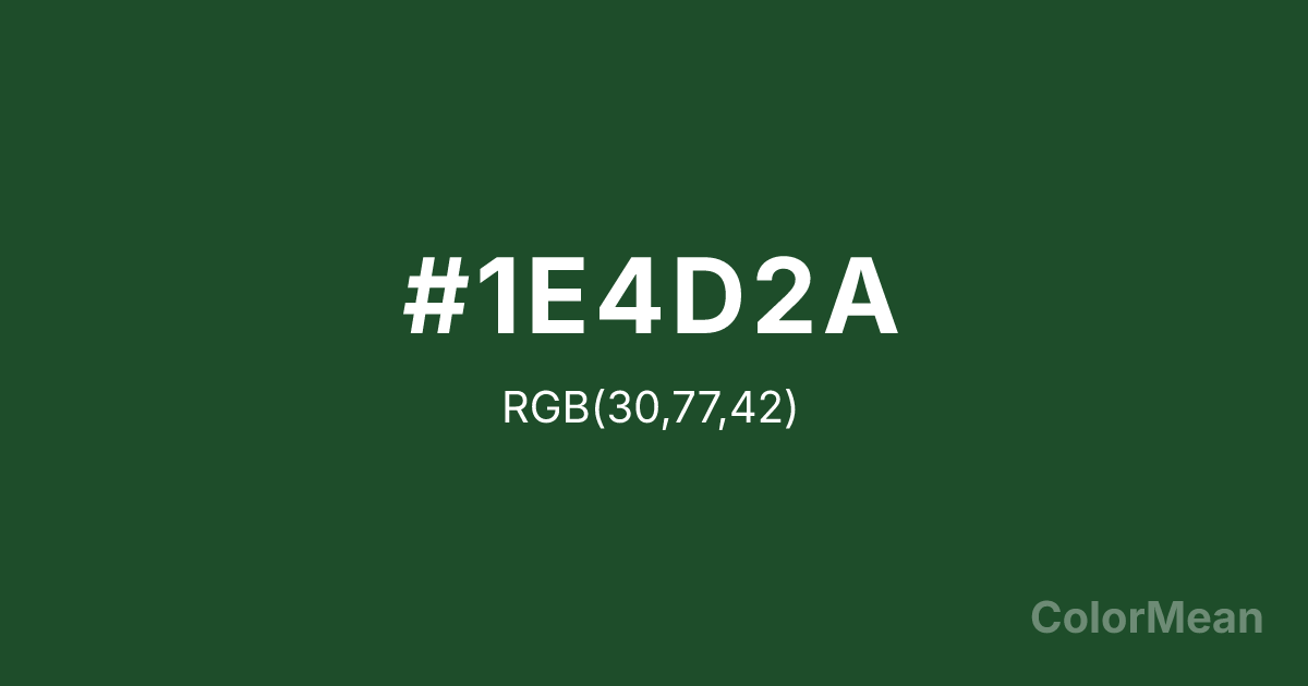
#1E4D2A Color Information
#1E4D2A RGB value is (30, 77, 42). The hex color red value is 30, green is 77, and blue is 42. Its HSL format shows a hue of 135°, saturation of 44 percent, and lightness of 21 percent. The CMYK process values are 61 percent, 0 percent, 45 percent, 70 percent.
#1E4D2A Color Meaning
Color #1E4D2A embodies academic rigor, ecological stewardship, and grounded innovation. Color #1E4D2A is a deep forest tone rooted in institutional identity—specifically California Polytechnic State University—but its psychological resonance extends far beyond campus. #1E4D2A shade merges the stability of dark green with the vitality of chlorophyll, creating a hue that feels both scholarly and alive. In color psychology, greens in #1E4D2A value range signal trust, growth, and long-term thinking, which explains their use in sustainability branding and educational platforms. Color #1E4D2A avoids the clinical edge of teal and the juvenility of lime, offering instead a mature, purposeful green. Functionally, color #1E4D2A works exceptionally well in print and digital contexts requiring authority without aggression. #1E4D2A provides strong contrast against white or light cream while remaining easy on the eyes during prolonged reading—key for academic or technical documentation. Environmental design studies show that deep greens like color #1E4D2A reduce stress responses more effectively than blues in indoor learning environments, likely due to their strong association with natural canopies. As a result, #1E4D2A appears in libraries, research labs, and agricultural tech interfaces where focus and calm must coexist. Culturally, color #1E4D2A reflects the “learn by doing” ethos—practical knowledge rooted in the earth. #1E4D2A symbolizes resilience through seasons, not spectacle. In spiritual contexts, #1E4D2A aligns with the heart chakra’s grounded expression: care that manifests through action, not just intention. Designers choose color #1E4D2A when they want to signal competence with conscience. Unlike flashy greens that chase trends, color #1E4D2A endures by connecting intellect to ecology.
Color Conversion
Convert #1E4D2A across different color models and formats. These conversions help designers work seamlessly between digital and print media, ensuring this color maintains its intended appearance across RGB screens, CMYK printers, and HSL color manipulations.
RGB Values & CMYK Values
RGB Values
CMYK Values
Color Variations
#1E4D2A harmonies come to life through carefully balanced shades, tints, and tones, giving this color depth and flexibility across light and dark variations. Shades add richness, tints bring an airy softness, and tones soften intensity, making it easy to pair in clean, modern palettes.
Color Harmonies
#1E4D2A harmonies create beautiful relationships with other colors based on their position on the color wheel. Each harmony type offers unique design possibilities, enabling cohesive and visually appealing color schemes.
Analogous
Colors adjacent on the color wheel (30° apart)
Complementary
Colors opposite on the color wheel (180° apart)
Split Complementary
Three colors using one base hue and the two hues beside its opposite
Triadic
Three colors evenly spaced (120° apart)
Tetradic
Four colors forming a rectangle on the wheel
Square
Four colors evenly spaced (90° apart)
Double Split
Four colors formed from two base hues and the colors next to their opposites
Monochromatic
Variations of a single hue
Contrast Checker
(WCAG 2.1) Test #1E4D2A for accessibility compliance against white and black backgrounds. Proper contrast ensures this color remains readable and usable for all audiences, meeting WCAG 2.1 standards for both normal and large text applications.
Sample Text
This is how your text will look with these colors.
Large Text (18pt+)
Normal Text
UI Components
Color Blindness Simulator
See how #1E4D2A appears to people with different types of color vision deficiencies. These simulations help create more inclusive designs that consider how this color is perceived across various visual abilities.
Normal Vision
protanopia
Note: These simulations are approximations. Actual color vision deficiency varies by individual.
CSS Examples
Background Color
Text Color
Sample Text
Border Color
Box Shadow
Text Shadow
Sample Text
Gradient
#1E4D2A Color FAQs
Frequently asked questions about #1E4D2A color meaning, symbolism, and applications. Click on any question to expand detailed answers.
