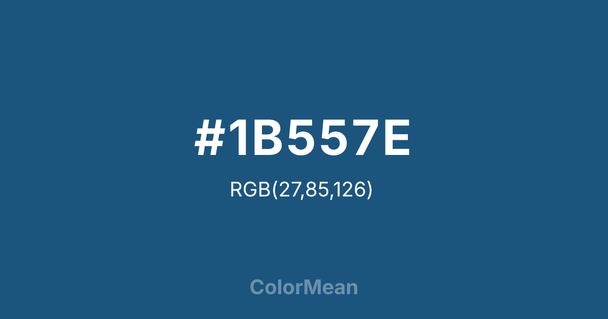
#1B557E Color Information
#1B557E RGB value is (27, 85, 126). The hex color red value is 27, green is 85, and blue is 126. Its HSL format shows a hue of 205°, saturation of 65 percent, and lightness of 30 percent. The CMYK process values are 79 percent, 33 percent, 0 percent, 51 percent.
#1B557E Color Meaning
Color #1B557E conveys maritime resolve, intellectual depth, and composed authority. Color #1B557E is a deep, slightly green-leaning navy that evokes the shadowed waters off coastal cliffs—calm on the surface, powerful below. Unlike brighter blues, #1B557E avoids cheerfulness, favoring instead a tone of quiet command. In color psychology, dark blues like color #1B557E are consistently linked to trust, competence, and long-term thinking, which explains their dominance in finance, legal, and academic branding. #1B557E hue signals reliability without rigidity, making #1B557E ideal for institutions that must balance tradition with relevance. Functionally, color #1B557E excels in both print and digital applications where readability and gravitas matter. #1B557E provides excellent contrast against white or light greys while reducing glare compared to pure black—critical for long-form reading in reports or dashboards. Accessibility studies confirm that color #1B557E meets WCAG AA standards for text when used correctly, supporting inclusive design. In packaging, #1B557E conveys premium quality without elitism, especially in skincare, spirits, and artisanal goods where heritage is implied but not shouted. Symbolically, color #1B557E represents depth that reveals itself over time—like ocean currents or archival knowledge. #1B557E is not the blue of instant answers but of sustained inquiry. In spiritual contexts, #1B557E aligns with the third eye chakra: perception refined through patience. Designers choose color #1B557E when they want to anchor a palette in stability without dullness. Its richness comes not from brightness but from restraint—a chromatic embodiment of earned wisdom.
Color Conversion
Convert #1B557E across different color models and formats. These conversions help designers work seamlessly between digital and print media, ensuring this color maintains its intended appearance across RGB screens, CMYK printers, and HSL color manipulations.
RGB Values & CMYK Values
RGB Values
CMYK Values
Color Variations
#1B557E harmonies come to life through carefully balanced shades, tints, and tones, giving this color depth and flexibility across light and dark variations. Shades add richness, tints bring an airy softness, and tones soften intensity, making it easy to pair in clean, modern palettes.
Color Harmonies
#1B557E harmonies create beautiful relationships with other colors based on their position on the color wheel. Each harmony type offers unique design possibilities, enabling cohesive and visually appealing color schemes.
Analogous
Colors adjacent on the color wheel (30° apart)
Complementary
Colors opposite on the color wheel (180° apart)
Split Complementary
Three colors using one base hue and the two hues beside its opposite
Triadic
Three colors evenly spaced (120° apart)
Tetradic
Four colors forming a rectangle on the wheel
Square
Four colors evenly spaced (90° apart)
Double Split
Four colors formed from two base hues and the colors next to their opposites
Monochromatic
Variations of a single hue
Contrast Checker
(WCAG 2.1) Test #1B557E for accessibility compliance against white and black backgrounds. Proper contrast ensures this color remains readable and usable for all audiences, meeting WCAG 2.1 standards for both normal and large text applications.
Sample Text
This is how your text will look with these colors.
Large Text (18pt+)
Normal Text
UI Components
Color Blindness Simulator
See how #1B557E appears to people with different types of color vision deficiencies. These simulations help create more inclusive designs that consider how this color is perceived across various visual abilities.
Normal Vision
protanopia
Note: These simulations are approximations. Actual color vision deficiency varies by individual.
CSS Examples
Background Color
Text Color
Sample Text
Border Color
Box Shadow
Text Shadow
Sample Text
Gradient
#1B557E Color FAQs
Frequently asked questions about #1B557E color meaning, symbolism, and applications. Click on any question to expand detailed answers.

