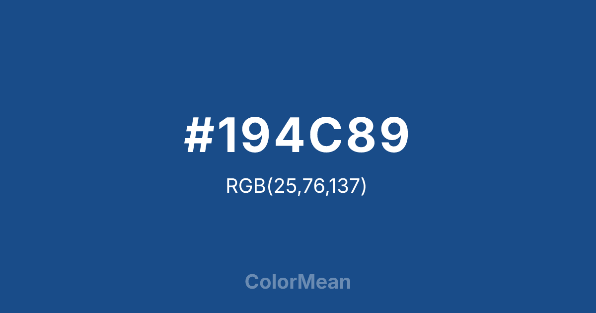
#194C89 Color Information
#194C89 RGB value is (25, 76, 137). The hex color red value is 25, green is 76, and blue is 137. Its HSL format shows a hue of 213°, saturation of 69 percent, and lightness of 32 percent. The CMYK process values are 82 percent, 45 percent, 0 percent, 46 percent.
#194C89 Color Meaning
Color #194C89 signifies dependable clarity, timeless trust, and structured optimism. Color #194C89—Pantone’s Color of the Year 2020—was chosen for its universal appeal and psychological stability during times of uncertainty. #194C89 deep, slightly green-leaning blue evokes clear skies at dusk, naval uniforms, and institutional reliability. In corporate and civic branding, #194C89 signals competence without coldness. Cognitive research confirms #194C89 improves focus and reduces anxiety more effectively than greys in digital workspaces. In design systems, color #194C89 functions as a versatile primary. #194C89 meets WCAG AAA contrast standards against white for body text and performs well across print and screen media. #194C89’s a staple in education, healthcare, and government interfaces where trust is non-negotiable. Print consistency is excellent, and its CMYK formula is widely calibrated. Color #194C89 doesn’t chase trends—#194C89 anchors them. Symbolically, color #194C89 represents hope that plans. #194C89 is not naive optimism but structured reassurance. In spiritual contexts, #194C89 aligns with the throat chakra’s truthful mode: communication that connects. Designers use color #194C89 when they want to signal stability with vision. Its confidence is quiet—but unwavering.
Color Conversion
Convert #194C89 across different color models and formats. These conversions help designers work seamlessly between digital and print media, ensuring this color maintains its intended appearance across RGB screens, CMYK printers, and HSL color manipulations.
RGB Values & CMYK Values
RGB Values
CMYK Values
Color Variations
#194C89 harmonies come to life through carefully balanced shades, tints, and tones, giving this color depth and flexibility across light and dark variations. Shades add richness, tints bring an airy softness, and tones soften intensity, making it easy to pair in clean, modern palettes.
Color Harmonies
#194C89 harmonies create beautiful relationships with other colors based on their position on the color wheel. Each harmony type offers unique design possibilities, enabling cohesive and visually appealing color schemes.
Analogous
Colors adjacent on the color wheel (30° apart)
Complementary
Colors opposite on the color wheel (180° apart)
Split Complementary
Three colors using one base hue and the two hues beside its opposite
Triadic
Three colors evenly spaced (120° apart)
Tetradic
Four colors forming a rectangle on the wheel
Square
Four colors evenly spaced (90° apart)
Double Split
Four colors formed from two base hues and the colors next to their opposites
Monochromatic
Variations of a single hue
Contrast Checker
(WCAG 2.1) Test #194C89 for accessibility compliance against white and black backgrounds. Proper contrast ensures this color remains readable and usable for all audiences, meeting WCAG 2.1 standards for both normal and large text applications.
Sample Text
This is how your text will look with these colors.
Large Text (18pt+)
Normal Text
UI Components
Color Blindness Simulator
See how #194C89 appears to people with different types of color vision deficiencies. These simulations help create more inclusive designs that consider how this color is perceived across various visual abilities.
Normal Vision
protanopia
Note: These simulations are approximations. Actual color vision deficiency varies by individual.
CSS Examples
Background Color
Text Color
Sample Text
Border Color
Box Shadow
Text Shadow
Sample Text
Gradient
#194C89 Color FAQs
Frequently asked questions about #194C89 color meaning, symbolism, and applications. Click on any question to expand detailed answers.

