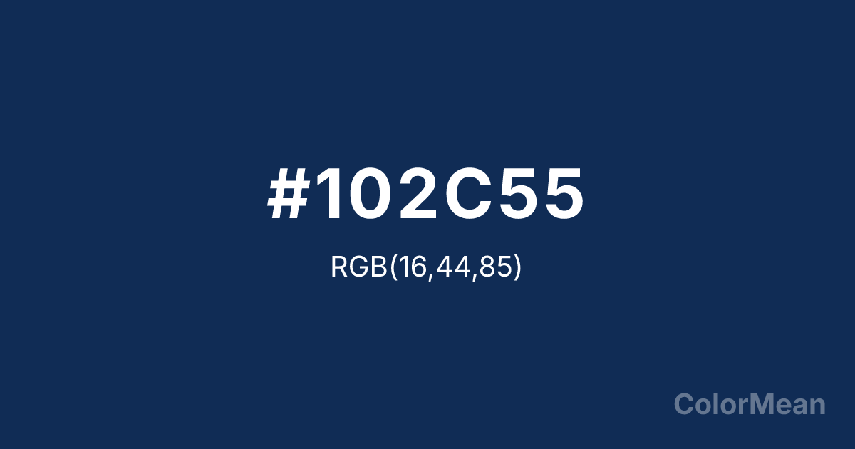
#102C55 Color Information
#102C55 RGB value is (16, 44, 85). The hex color red value is 16, green is 44, and blue is 85. Its HSL format shows a hue of 216°, saturation of 68 percent, and lightness of 20 percent. The CMYK process values are 81 percent, 48 percent, 0 percent, 67 percent.
#102C55 Color Meaning
Color #102C55 signifies profound depth, celestial mystery, and silent authority. #102C55 very dark, slightly purplish blue is the color of the sky just after dusk, the deep sea at night, and distant mountain ranges. Psychologically, color #102C55 is absorbing, contemplative, and awe-inspiring, encouraging introspection, reverence, and a sense of vast, quiet potential. #102C55 conveys a solemn, dignified authority and the promise of hidden knowledge. #102C55 color is the visual representation of profound silence. Culturally, color #102C55 is associated with astronomy, nautical navigation, and formal academic regalia, symbolizing the pursuit of unknown frontiers, disciplined study, and established institutions of knowledge. Symbolically, #102C55 represents the infinite, the source of wisdom, and the protective cloak of night. Spiritually, color #102C55 connects to the cosmic consciousness of the crown chakra, embodying the deep, silent unity of the universe and the intellect's reach into the unknown.
Color Conversion
Convert #102C55 across different color models and formats. These conversions help designers work seamlessly between digital and print media, ensuring this color maintains its intended appearance across RGB screens, CMYK printers, and HSL color manipulations.
RGB Values & CMYK Values
RGB Values
CMYK Values
Color Variations
#102C55 harmonies come to life through carefully balanced shades, tints, and tones, giving this color depth and flexibility across light and dark variations. Shades add richness, tints bring an airy softness, and tones soften intensity, making it easy to pair in clean, modern palettes.
Color Harmonies
#102C55 harmonies create beautiful relationships with other colors based on their position on the color wheel. Each harmony type offers unique design possibilities, enabling cohesive and visually appealing color schemes.
Analogous
Colors adjacent on the color wheel (30° apart)
Complementary
Colors opposite on the color wheel (180° apart)
Split Complementary
Three colors using one base hue and the two hues beside its opposite
Triadic
Three colors evenly spaced (120° apart)
Tetradic
Four colors forming a rectangle on the wheel
Square
Four colors evenly spaced (90° apart)
Double Split
Four colors formed from two base hues and the colors next to their opposites
Monochromatic
Variations of a single hue
Contrast Checker
(WCAG 2.1) Test #102C55 for accessibility compliance against white and black backgrounds. Proper contrast ensures this color remains readable and usable for all audiences, meeting WCAG 2.1 standards for both normal and large text applications.
Sample Text
This is how your text will look with these colors.
Large Text (18pt+)
Normal Text
UI Components
Color Blindness Simulator
See how #102C55 appears to people with different types of color vision deficiencies. These simulations help create more inclusive designs that consider how this color is perceived across various visual abilities.
Normal Vision
protanopia
Note: These simulations are approximations. Actual color vision deficiency varies by individual.
CSS Examples
Background Color
Text Color
Sample Text
Border Color
Box Shadow
Text Shadow
Sample Text
Gradient
#102C55 Color FAQs
Frequently asked questions about #102C55 color meaning, symbolism, and applications. Click on any question to expand detailed answers.
