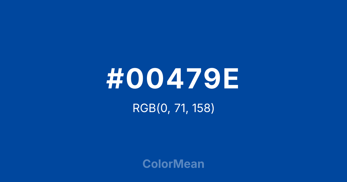
#00479E Color Information
#00479E RGB value is (0, 71, 158). The hex color red value is 0, green is 71, and blue is 158. Its HSL format shows a hue of 213°, saturation of 100 percent, and lightness of 31 percent. The CMYK process values are 100 percent, 55 percent, 0 percent, 38 percent.
#00479E Color Meaning
Color #00479E represents discipline, focus, and authoritative clarity. #00479E medium-dark, vivid blue evokes integrity, reliability, and structured calm. Psychologically, color #00479E enhances concentration, decision-making, and intellectual stability, making #00479E suitable for educational or professional contexts. Culturally, blue shades like color #00479E are linked to trust, loyalty, and professionalism in Western societies, while Eastern traditions associate deep blues with calm insight, reflection, and spiritual clarity. Feng Shui favors blue in knowledge, career, or meditation areas to support wisdom, communication, and focus. Spiritually, #00479E aligns with the throat chakra, encouraging clear expression, truthfulness, and balanced communication. In design, color #00479E functions as a foundation color for uniforms, logos, or digital interfaces. Artists use #00479E to depict sky, water, or calm shadow areas. Its dark, vivid tone conveys strength, focus, and dependability without overwhelming complementary elements.
Color Conversion
Convert #00479E across different color models and formats. These conversions help designers work seamlessly between digital and print media, ensuring this color maintains its intended appearance across RGB screens, CMYK printers, and HSL color manipulations.
RGB Values & CMYK Values
RGB Values
CMYK Values
Color Variations
#00479E harmonies come to life through carefully balanced shades, tints, and tones, giving this color depth and flexibility across light and dark variations. Shades add richness, tints bring an airy softness, and tones soften intensity, making it easy to pair in clean, modern palettes.
Color Harmonies
#00479E harmonies create beautiful relationships with other colors based on their position on the color wheel. Each harmony type offers unique design possibilities, enabling cohesive and visually appealing color schemes.
Analogous
Colors adjacent on the color wheel (30° apart)
Complementary
Colors opposite on the color wheel (180° apart)
Split Complementary
Three colors using one base hue and the two hues beside its opposite
Triadic
Three colors evenly spaced (120° apart)
Tetradic
Four colors forming a rectangle on the wheel
Square
Four colors evenly spaced (90° apart)
Double Split
Four colors formed from two base hues and the colors next to their opposites
Monochromatic
Variations of a single hue
Contrast Checker
(WCAG 2.1) Test #00479E for accessibility compliance against white and black backgrounds. Proper contrast ensures this color remains readable and usable for all audiences, meeting WCAG 2.1 standards for both normal and large text applications.
Sample Text
This is how your text will look with these colors.
Large Text (18pt+)
Normal Text
UI Components
Color Blindness Simulator
See how #00479E appears to people with different types of color vision deficiencies. These simulations help create more inclusive designs that consider how this color is perceived across various visual abilities.
Normal Vision
protanopia
Note: These simulations are approximations. Actual color vision deficiency varies by individual.
CSS Examples
Background Color
Text Color
Sample Text
Border Color
Box Shadow
Text Shadow
Sample Text
Gradient
#00479E Color FAQs
Frequently asked questions about #00479E color meaning, symbolism, and applications. Click on any question to expand detailed answers.
